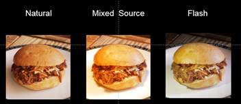
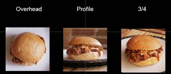
- 1. Perfection: 3/4 with Natural Light
- 2. Good: Profile with Natural Light
- 3. So-So: Mixed Light Source
- 4. Bad: Overhead
- 5. Terrible: 3/4 with Flash
With the holidays just around the corner, you’re going to be assaulted with a variety of dishes and plates that are just begging to be Instagram-ed.
That perfectly golden-brown Thanksgiving turkey? Post it quick to show cousin Randy what he’s missing. That amazing pumpkin pie cheesecake with real whipped cream? Tweet it out to inspire jealousy in your brother. Your epic Christmas ham? Blast it all over your social media accounts so everyone can see what a master chef you are. Because, in the immortal words of the internet’s ragamuffins that echo through each of our ears whenever something truly great happens to us, “Pics or it didn’t happen.” In short, you better have the the images to back-up your post-holiday water-cooler big-talk, otherwise your co-workers just might not believe you. Especially if you’re already a bit of a braggadocio.
A lot goes into getting a great food photography shot–lighting must be perfect (not too bright, not too dark), the angle of the image must be open enough to see the food, but not so drastic that the picture looks like an avant-garde post-Warhol macro-focus, and the colors have to be just saturated enough to make the food look delicious, but not so much that it ends up looking like a plasticine model made for a Saveur magazine shoot.
So, in preparation for this gauntlet of Instagrammable goodness, we picked up some food photography tips and tricks from the cooks and chefs that make up ChefsFeed, an online community that “connect[s] people with the culinary industry in an unfiltered and relevant way.” Check out the three major rules we learned from ChefsFeed (as told by Roxanne Webber, VP of Media), along with some additional questions and answers to round-out your skills. Follow these rules religiously for a perfect picture every time.
Rule #1: Let’s Talk Light
- Natural light is always best – bring the dish outside if you have to!
- Don’t mix light sources – food looks bad when its shot in an array of different light sources, it creates conflicting color tones.
- Leave the flash off forever and ever and ever and ever. Also, did we mention to never use the flash?
Check out the images below. The image taken with all-natural light looks best–though the mixed source isn’t terrible, it just looks a little dried out. Not good if you want your moist turkey to actually look moist.

Rule #2: Composition
- Get close and take a moment to style it – move yourself and the dish to find the perfect angle.
- If you can’t figure out an angle, go for a flat profile shot (aka a “flat lay”). The flat lay is also the perfect shot for pasts dishes or other fairly full plates.
- A 3/4 shot works with almost any type of food that has some height and structure to it.

Rule #3: Authenticity
- Don’t be perfect, be interesting – have a voice that is true to your personal brand.
- If you have a filter you always use, don’t stop now–by all means continue–it will keep your food photography within the aesthetic range of all your other posts and consistency is key to garnering followers and likes.
Other Tips and Tricks
What’s the best way to photograph a soup?
Soup or food in a bowl/dish with high sides does pose a unique challenge to photograph, since obviously the side view isn’t so much of an option. Given that, position it and serve it in a way that is conducive to an overhead shot. If it’s a chunky soup, you can always incorporate some of its contents into the shot by getting a spoon into your mix.
And for a drink?
Drinks can be challenging if they are in stemware. One consideration is to try and get them with a minimal background that you can keep out of focus if you’re trying to capture the side shot of it so it’s not lost. Additionally, with cocktails it can be nice to be sure the glass is super cold and frosty, which just looks a little extra appealing.
What do you do in extremely low-light situations–like a fancy restaurant? Or at a night? Do you just throw caution to the wind and use a flash? Or do you really not use flash ever?
It’s not worth using a flash in my opinion, not only will it not do the chef’s food justice, it will kill the vibe for both you, your companion, and your fellow diners.
What tends to appeal more: a pristine plate, or one that has obviously been dug into?
I think the answer to that depends a lot on your audience and your own personal style/brand that you are trying to cultivate. At ChefsFeed, we tend to go for a less intensely styled, more authentic approach to our media, but we also like them to be beautiful and reflective of the chef and restaurant they belong to. If it’s a very beautiful, composed, pristine dish and venue, we want to reflect that chef’s vision in our representation of their food in our photos and videos. So we think a lot about shooting in a manner that reflects the individual chef and restaurant accurately and appropriately.
Fore more photography tips, recipes, videos, and restaurant guides, check out ChefsFeed’s website or download the app.
Featured Image Credit: Agustín Nieto via Flickr.


