Minimalist homes never go out of fashion. The clean lines are visually appealing and the monochromatic color palette offers a blank slate to build upon should the desire for change arise. But minimalism also hasn’t changed much over the years, resulting in homes that tiptoe close to becoming cookie-cutter.
Thankfully, the folks at Belzberg Architects have created a sophisticated home that checks all of the minimalist boxes while putting a futuristic spin on things. Bridge House says “no thanks” to the traditional black and white color palette typical of minimalist homes, embracing soothing tones for a sophisticated finish.
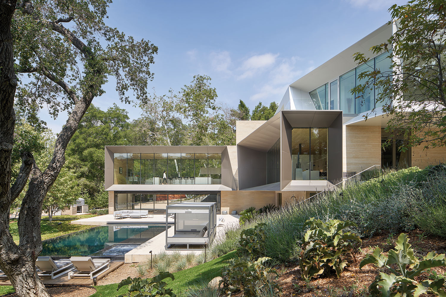
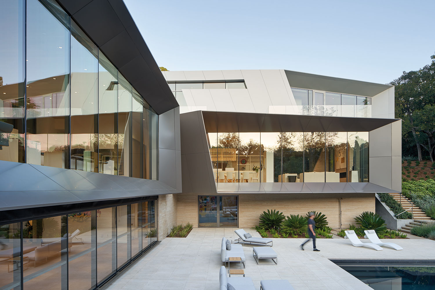
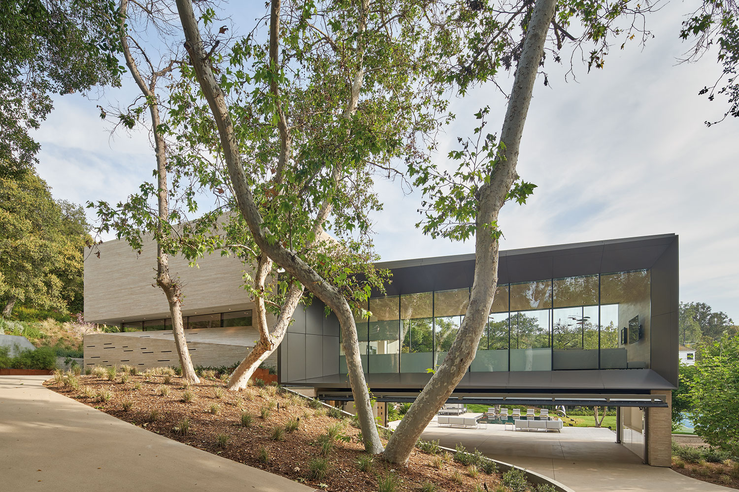
A challenging site helped to define the layout of Bridge House. The land was sharply sloped and the hill was topped by neighbors, making privacy a key concern. By abutting the back of the home to the hill and creating a wing that runs perpendicular to the hill, thereby bridging the slope, the team at Belzberg created a visually striking residence that provides seclusion while capturing views of beautiful SoCal vistas.
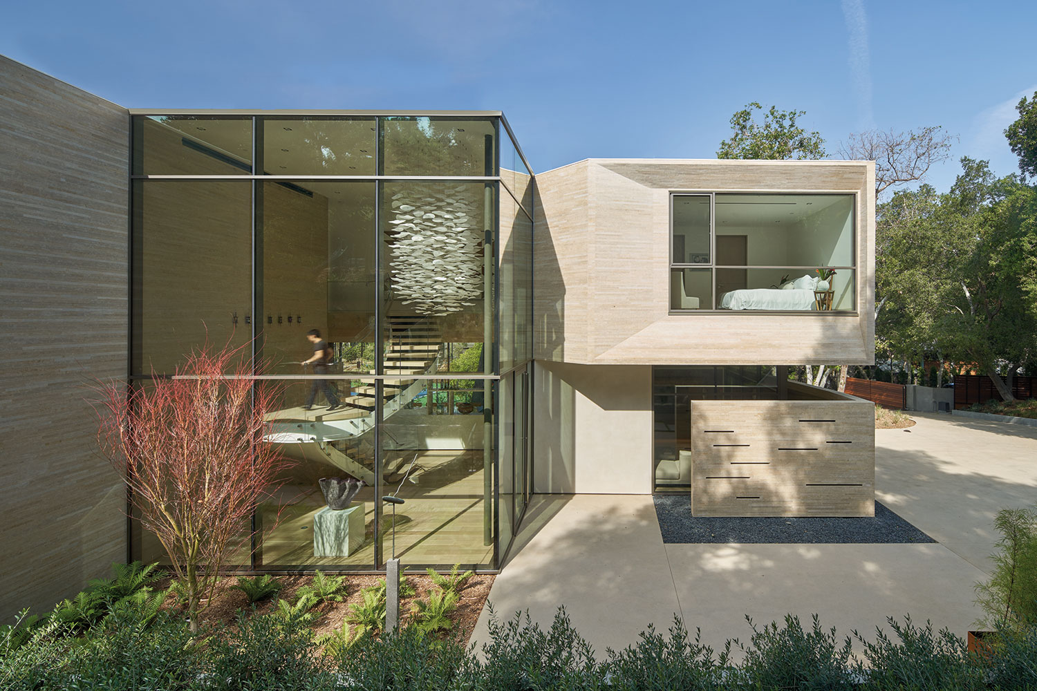
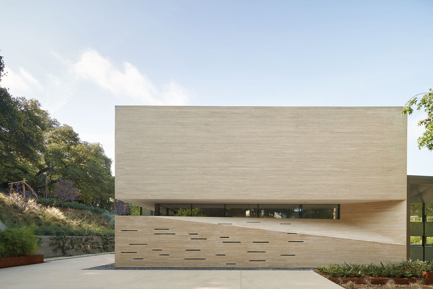
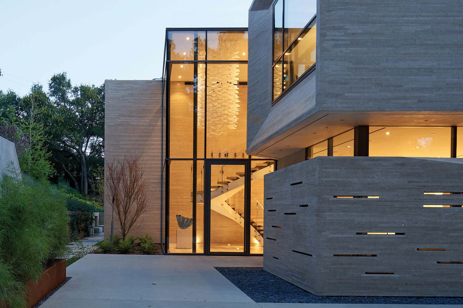
While the back of the home is opaque for privacy, the front is open and welcoming. The stacked box style of contemporary minimalist homes takes on a futuristic feel thanks to deeply faceted metal frames around the windows. The exterior materials — beige dry-stacked Hera limestone and medium tone gray metal — beautifully complement each other in their earthy tones, a welcome contrast from the typical all-white minimalist homes of the past.
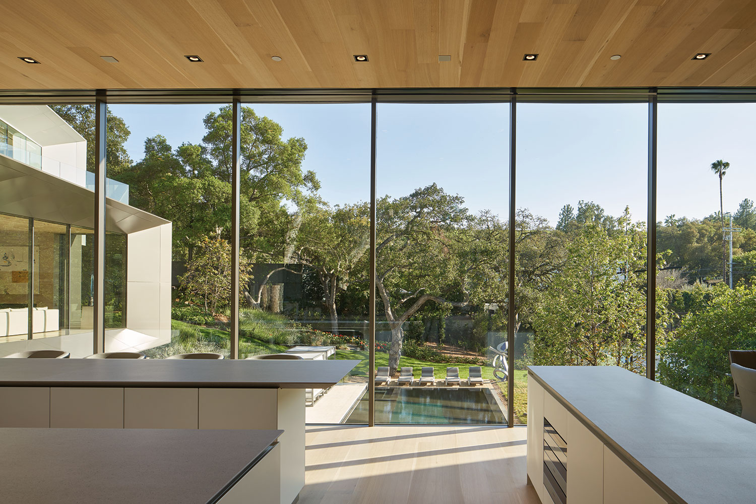
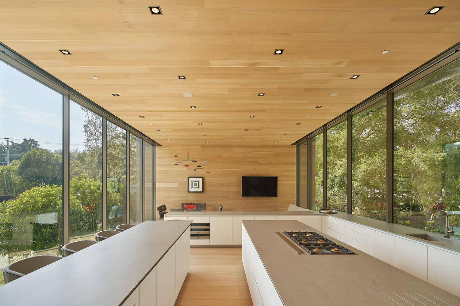
The L-shaped home received its name from the wing that bridges out over the land. This wing was designed to be the “control center” or “bridge” of the home. With 12-foot ceilings and walls of glass on either side, this second story wing is where the family room is located. A clean-lined, minimalist kitchen takes up much of the space and leads to a combined dining and living area. Below the wing is the garage. The doors to the garage can be fully opened, creating an open-air multi-purpose room when entertaining. This also results in an optical illusion — making the bridge appear to float above the ground and turning the kitchen into more of a focal point, showcasing it as the heart of the home.
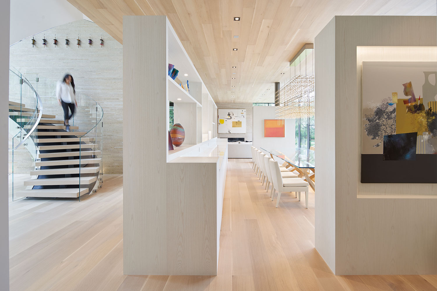
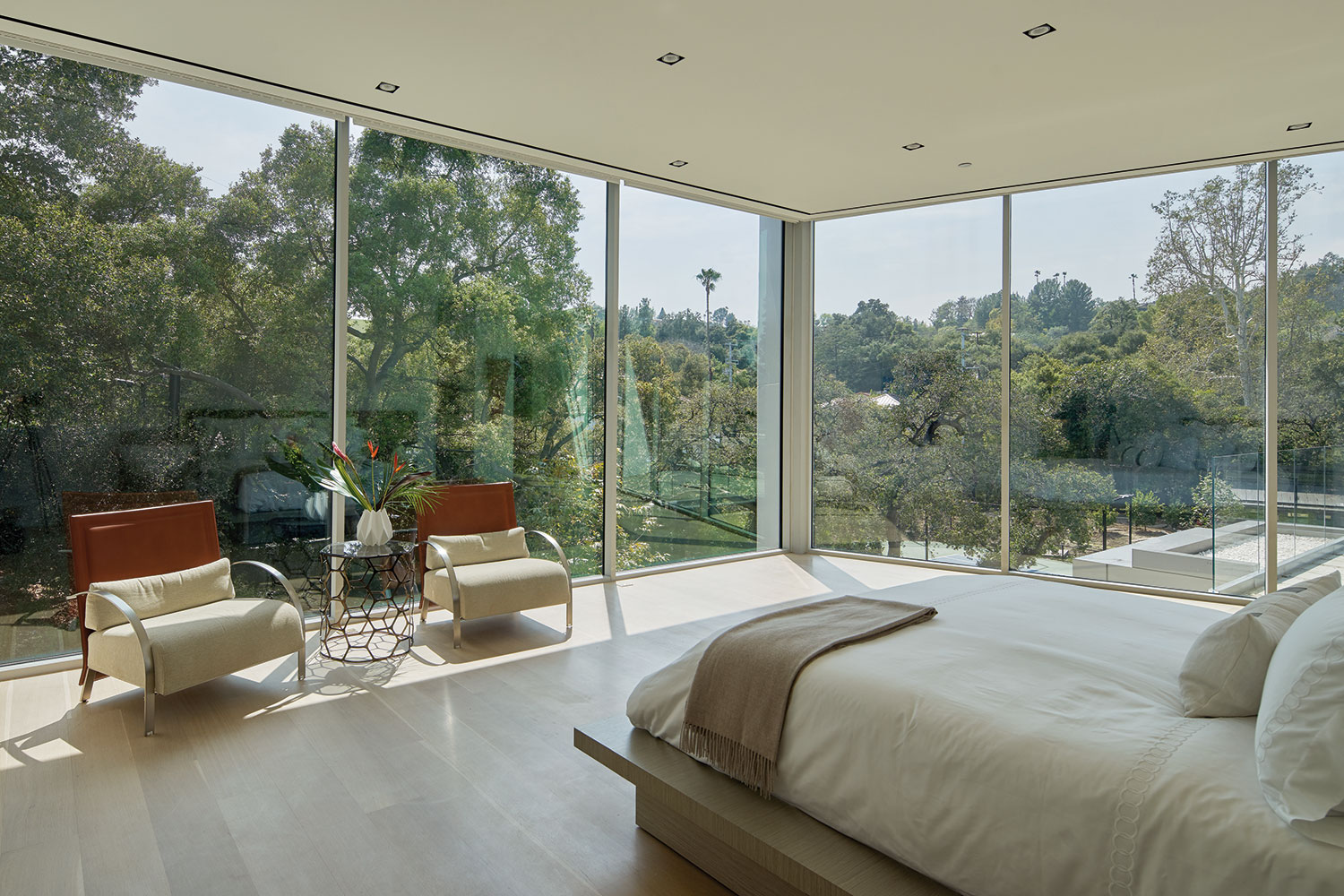
Inside, the nature-inspired color palette from outside continues. The limestone walls are complemented by the addition of natural white oak wood on the floors, ceilings, and accent walls. The L-shape of the home means that most rooms face the front of the home where walls of glass let in plenty of natural light. This, combined with the bright materials and high ceilings, make rooms feel spacious and welcoming. It also means every room has beautiful views to the outside, a key element of the minimalist philosophy.
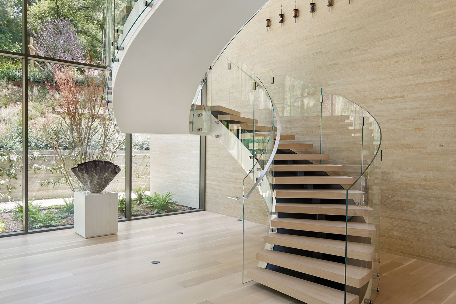
Every corner of Bridge House was carefully thought out to create stunning moments throughout the home. Take the entry gallery for example. A swooping spiral staircase greets visitors. It is itself a work of art, with glass railings, light wood floating treads, and white steel supports. Thoughtfully placed in a glass-enclosed, atrium-style space and complemented by a massive sculptural piece suspended from the ceiling, just walking up the stairs is like taking a stroll through MoMa.
Outside the luxury continues. At the bottom of the hill, there is a full-size tennis court. An infinity pool adorns the patio, surrounded by lounge chairs and a stylish cabana. Shaded by old-growth trees, it’s a secluded retreat perfect for enjoying those beautifully sunny SoCal afternoons. And thanks to its west-facing location, it’s also a great spot for watching the sunset.
Much of contemporary architecture has been about looking to the past to revive some of our favorite styles. Minimalism has been one of those styles, but without much change to it. Bridge House is a shining example of taking the important philosophies that helped to build minimalism while putting a refreshingly new spin on it that feels exciting, forward-thinking, and sophisticated.
