This House in the Woods is a Prefab Home That Doesn’t Look Prefab

There’s a problem with prefabs. They look like prefabs.

Recommended Videos

Quickly put together in a factory and shipped in pieces to the build site, they are often small, simplistic square structures. We’ve seen companies that are changing the prefab game by creating interesting shapes and joining them together to create larger structures, but the results are contemporary homes that almost become art installations — something that doesn’t necessarily have mass appeal.

Of course, there are plenty of benefits to prefabs, which is why they are becoming more and more popular. Prefab homes are typically energy efficient, built with high-quality sustainable materials, and generate much less construction waste than the typical home build. So what about those folks that love the idea of the prefab, yet want a place that looks like a typical home?
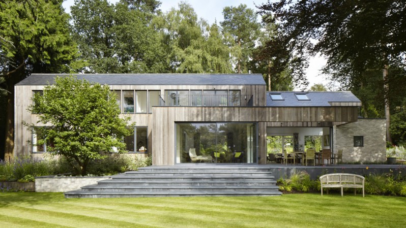
Image used with permission by copyright holder

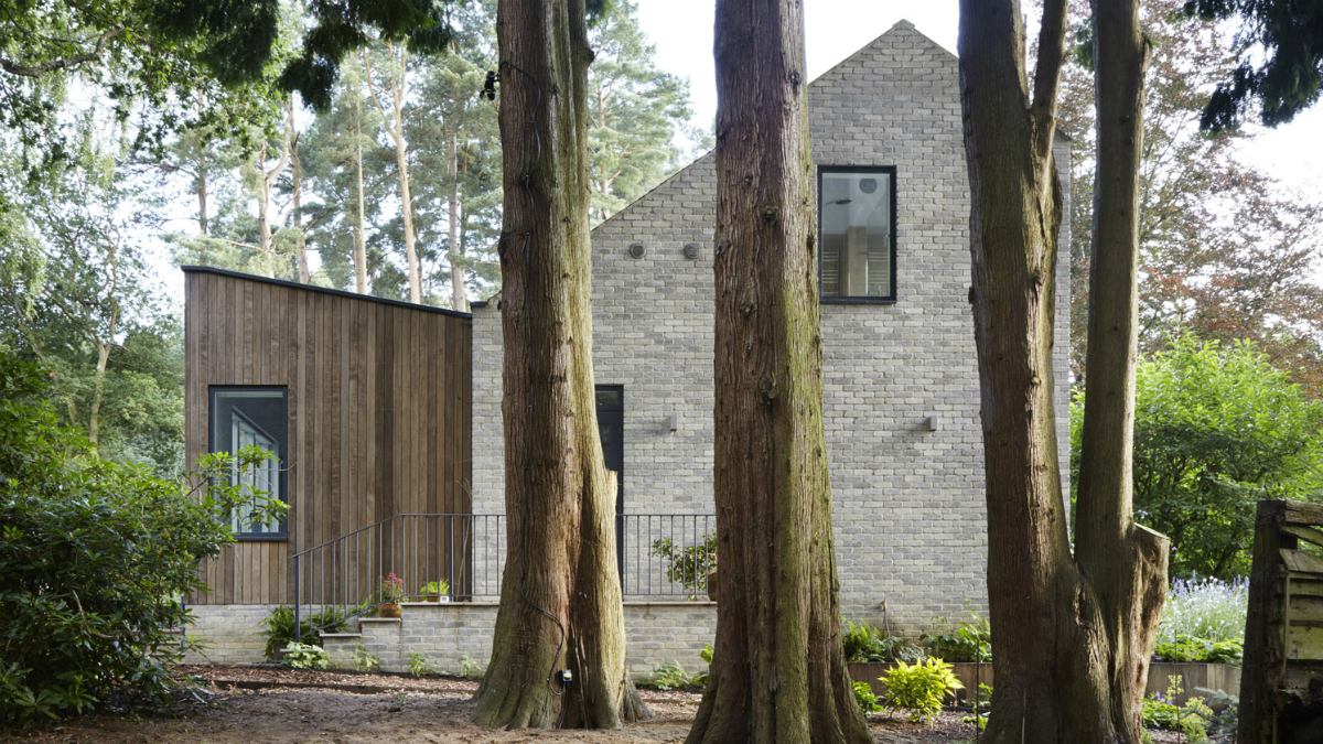
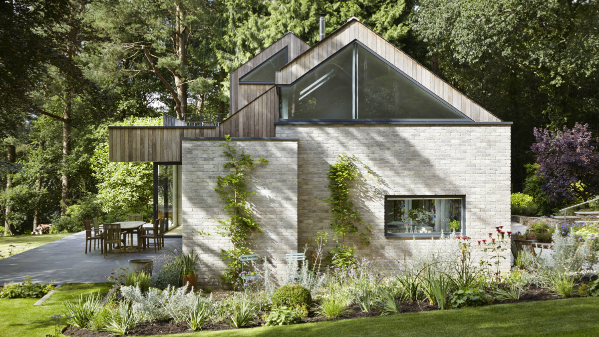
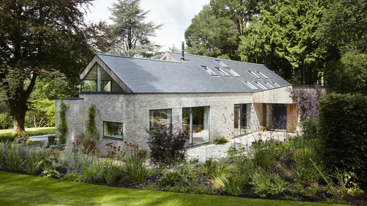
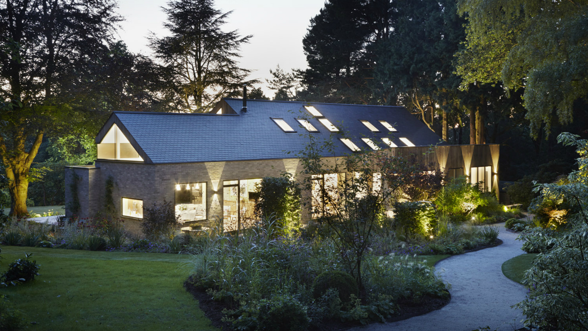
The folks at architectural firm Alma-Nac have created just that with the House in the Woods. Built among the trees in the woods of Hampshire, England, House in the Woods is a prefab that looks like a typical home. Inspired by Russian Dachas (a type of seasonal home that usually sits on a small piece of land with a garden), Alma-Nac designed the home with prefabricated panels that were shipped to the site. With that system, the home was built in a mere 10 days.

The firm specializes in creating structures that take their lead from the natural surroundings, and it was no different with this build. The small property featured many old-growth trees which they used to their advantage; the home was positioned to maximize privacy for the owners and still allow sunlight to fill the interior.
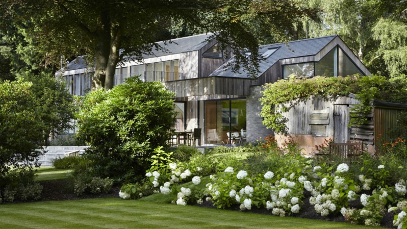
Image used with permission by copyright holder

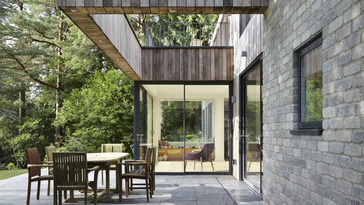
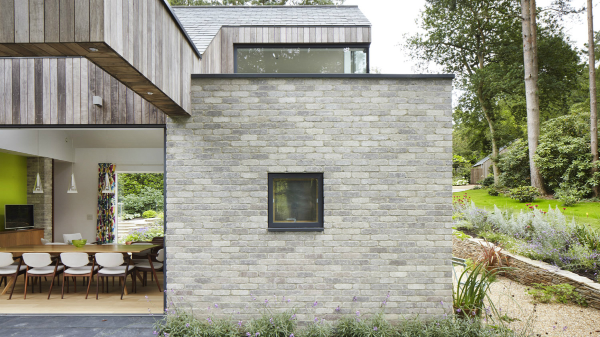
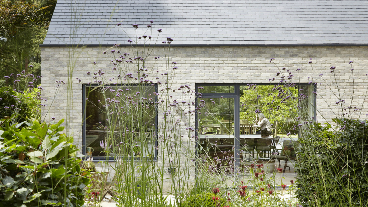
Outside, a traditional English garden surrounds the home and leads visitors to the entry. The front facade of the home was designed in a traditional style to compliment the garden. In the back, however, a more modern form takes hold where a low deck steps down into the backyard.

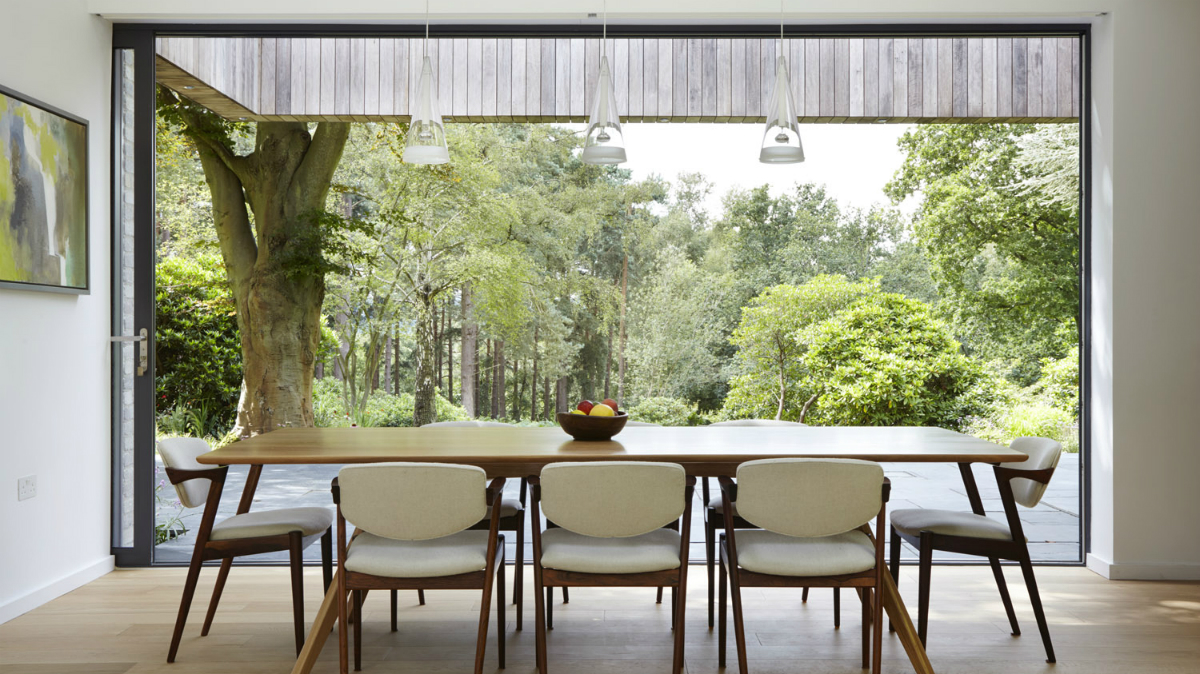
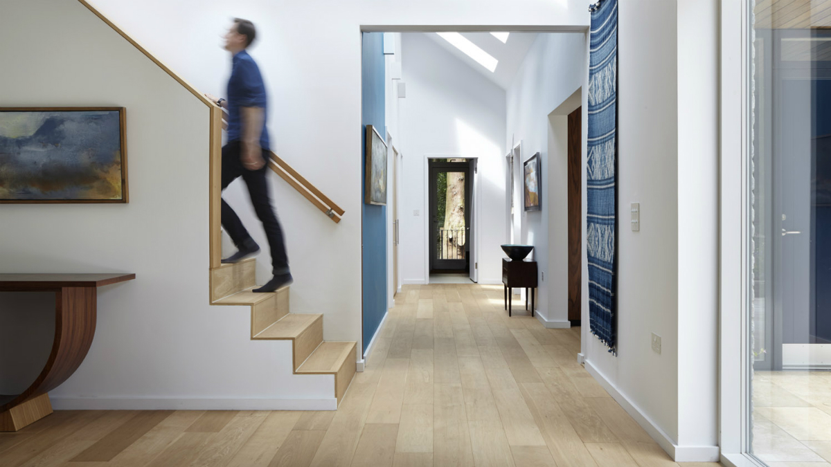
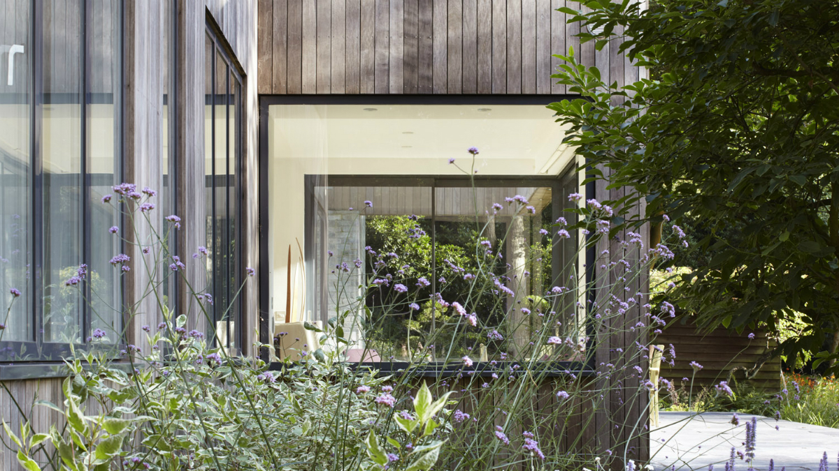
Inside, the mid-century modern influences take hold. Walls of glass open up, turning spaces into indoor-outdoor rooms and creating a solid connection to nature. Simple materials like white walls and light wood flooring keep the space feeling bright and airy. Mid-century modern furniture is sprinkled throughout the home. A few bright accent walls in nature-inspired tones add pops of color to the home. It all comes together to create a space that truly feels like a custom built home and not the factory built prefab that it is. If you can believe it.
Kelsey Machado
Former Digital Trends Contributor
Kelsey is a professional interior designer with over a decade of experience in the design field. With a passion for…
Makatita Tiny House Has All the Right Angles in All the Right Places
liberte tiny houses makatita house 3

In the early days of the movement, the appeal of tiny houses was just that — they were tiny. It was new and exciting to try to figure out how to live life in less than 300 square feet. But a decade into the trend, squeezing inside of a basic box has become boring. One tiny house company in the Netherlands has brought the excitement back to going small. The sculptural Makatita Tiny House has sharp angles and an organic design that makes it stand out in the world of small structures.

Calling it the company's “most special house to date,” the team at Liberté Tiny Houses put a lot of love into the creation of the Makatita Tiny House. Many of the brand's previous designs featured angles, usually in the form of a sloped roof. But with Makatita, the angles took on a light of their own, defining the entire project and turning the tiny house into something beyond just a place to live. It became an architectural work of art.

Read more
You Can’t Have a Fear of Heights If You Want to Stay at Cliff Boutique Hotel
Cliff Concept Boutique Hotel – Norway

Norway is an adventure lover’s dream destination. You can take your pick of one-of-a-kind explorations like kayaking fjords, ice-climbing glaciers, or daring to step to the edge of the famous Preikestolen, or “Pulpit Rock” -- all while surrounded by some of the most stunning landscapes in the world. If you thought the thrill-seeking couldn’t get any more extreme than that, check out this daring new concept design that puts a hotel right on the side of Preikestolen. 

Cliff Boutique is five stories (and nine total suites) of vertigo-inducing views. Created by interior architect Hayri Atak, the concept drawings for the hotel show it built into the side of the cliff. To maintain the look of Pulpit Rock, which gently curves inward, each floor of the hotel is a bit narrower than the one above it. Clad in dark gray concrete panels, the design is intended to help the hotel blend in with the surrounding rocks, preserving the integrity of the famous site. 

Read more
A Futuristic Minimalist Home Hugs the Hills in Southern California
bridge house belzberg architects minimalist architecture 6

Minimalist homes never go out of fashion. The clean lines are visually appealing and the monochromatic color palette offers a blank slate to build upon should the desire for change arise. But minimalism also hasn’t changed much over the years, resulting in homes that tiptoe close to becoming cookie-cutter.

Thankfully, the folks at Belzberg Architects have created a sophisticated home that checks all of the minimalist boxes while putting a futuristic spin on things. Bridge House says “no thanks” to the traditional black and white color palette typical of minimalist homes, embracing soothing tones for a sophisticated finish.

Read more