Brutalism. The word brings to mind cold, soulless concrete buildings. But there’s so much more to this surprisingly complex style than concrete. From Modernist influences to a contemporary rethinking of the style, it’s time to give brutalism a closer look.
Principles
Brutalism, which gained popularity in the 1950s and ’60s, has received a bad rap over the decades since due to its pared-down look and overabundance of concrete. To better understand and gain an appreciation for the style, you need to know where it came from. Modernist icon Le Corbusier had a serious love affair with concrete and termed his designs “béton brut,” French for “raw concrete”. It was meant to describe the way in which he was using the material. But thanks to a few harsh critics, the term morphed into “new brutalism” with the idea that the architectural style was “brutal,” both to look at and be in.
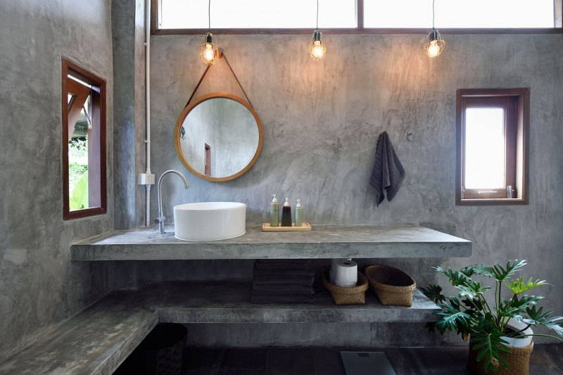
Le Corbusier and other architects who adopted the style intended their concrete buildings to be the ultimate form of the “less is more” principle that had developed as a counter-movement to post-war ostentatious designs. Brutalism was meant to be so simple in materials and style that users would inherently know how to use the space while forming connections with each other. What ended up happening, though, is that the style was quickly adopted by socialist countries and governments looking for buildings that were sturdy and cheap to build yet felt imposing. The result is that by the 1980s, the style was out of fashion and all but abandoned by future-thinking architects.
Recently, there’s been a revival of the design principles that took hold during the modernist movement. People want affordable homes built with simple, natural materials that create a strong connection to the outdoors while providing open spaces for social connections indoors. There is greater admiration for materials used whether they be reclaimed wood, natural stone, or raw concrete. Brutalism checks all of these boxes, which is why it was primed for a revival now in the 21st century.
Architecture
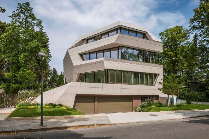
Simplicity is the name of the game when it comes to brutalist architecture. Minimalism was becoming popular at the same time as brutalism and there is a bit of overlap between the two styles. The main difference is that while minimalism focused on simplicity as a way to connect to nature, brutalism used simplicity to make interiors as functional as possible.
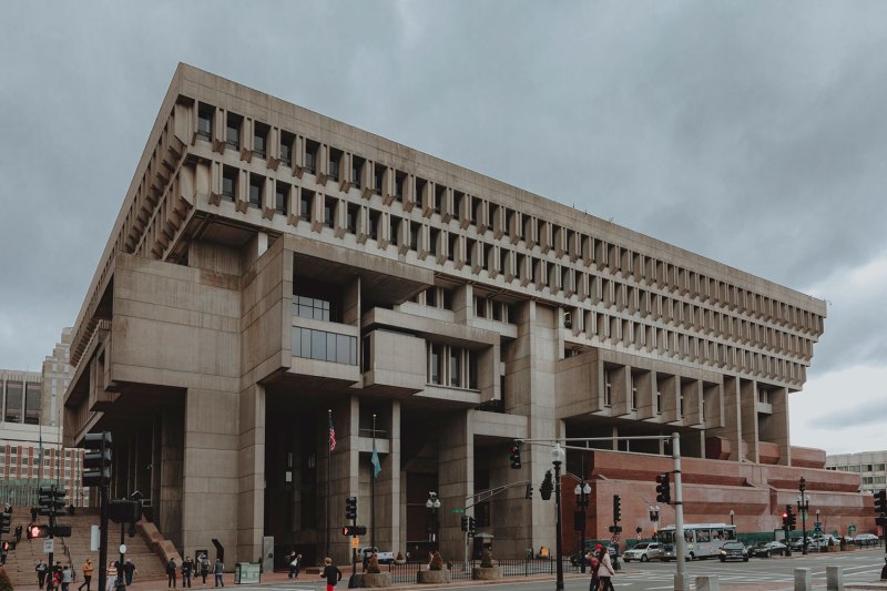
Outside, there is a clear geometric repetition to brutalist structures. There is no ornamentation on the facade, windows are basic rectangles, and raw concrete is the only material used. Despite the lack of ornate design elements, many brutalist buildings softened the harsh look of the concrete by adding curved walls or interesting shapes like the upside-down pyramid of the upper floors of Boston City Hall.
Furniture, Colors, Patterns
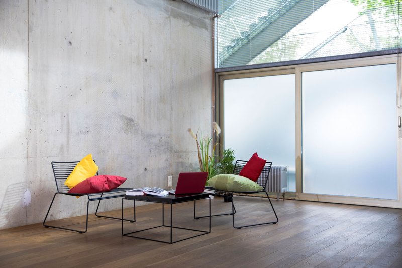
When brutalism first took hold, it was mainly an architectural style. Furnishings followed the minimalist look. Most pieces were black or white, made of leather, glass, or steel. Following the simplicity of the architecture, furniture stuck to clean lines with geometric forms (think Le Corbusier’s famous club chair). Today, furnishings for brutalist spaces are meant to be a contrast to the stark concrete walls and add a feeling of coziness and warmth to a space. Wood tables and upholstered seating are key to creating a new-wave brutalist home.
With concrete being the dominant material, you would expect the main color to be basic gray. But new technologies and techniques for creating concrete have broadened the scope of this material. Concrete comes in a wide range of neutral colors beyond gray, everything from earthy sand tones to blues and reds, thanks to dyes that can be added. Concrete can also be left raw, polished, or stamped to create visual interest.
New wave brutalism focuses on a neutral color palette with pops of color, a bright orange sofa in the living room, red accent tile in the kitchen, or soothing green sheets in the bedroom. There are plenty of chances to incorporate fun colors, adding life and excitement to your home. It’s also good to add plenty of plants to a brutalist home. It’s another way to add pops of color and soften the concrete surfaces.
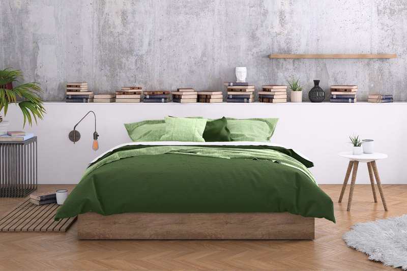
Patterns in a brutalist home come from the natural pattern in raw concrete, the grains in wood furnishings, or any artwork you chose to display. The great thing about a brutalist space is that it is a blank slate, allowing you to incorporate whatever style of artwork you want, from photography to sculpture to paintings. Every type of art will shine against a brutalist background.
Notables
While architects like Le Corbusier and Marcel Bruer were the big names in brutalism when the style first took hold, it’s the architects of today that have made the look their own. The new wave of Brutalism has seen a softening thanks to elements like warmer tones of concrete, gentle curves being added to the architecture, and the incorporation of other natural materials like wood. One of the most prominent contemporary Brutalist architecture teams is Vo Trong Nghia Architects. Their Bihn House was the winner of several awards when it debuted, showing the world that Brutalism can be beautiful.
Where to Shop
Budget
Brutalism’s blank slate allows you to incorporate varying styles of furniture. There is no one rule for decorating a brutalist room, so whatever style furniture speaks to you, go with it! We particularly like World Market for its affordable home goods and wide variety. Start with the mid-century modern-inspired Xander Loveseat, add in a global style bright area rug for a pop of color and a rustic natural wood coffee table to make a living room that is stylish and cozy.
Middle of the Line
Article has a great range of stylish pieces, offering everything from sofas to throw pillows. While the company has a strong mid-century modern aesthetic, there is a contemporary twist to many pieces that perfectly complement a brutalist home. You can put together a reading corner by combining the Charme Black Nord Leather Lounge Chair with the natural wood Tana Stool. Light the spot with the Tangent Dome Pendant Light in black and you’ve got a relaxing, soothing space to unwind after a hectic day.
High End
Blu Dot is a great opportunity to get those heirloom pieces you will want to keep for a lifetime. The Second Best dining table is simple in design and made from beautiful natural wood. It’s a piece that is at home in any style space and can be updated by switching out the chairs or dinnerware. Paired with the fun Real Good Chair in a bright color, you’ve got the perfect brutalist dining room to wow guests at that next big holiday dinner.


