Makatita Tiny House Has All the Right Angles in All the Right Places

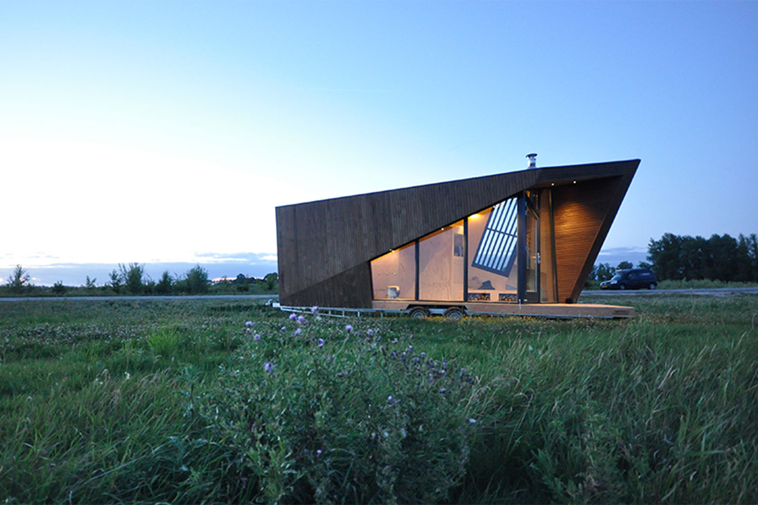
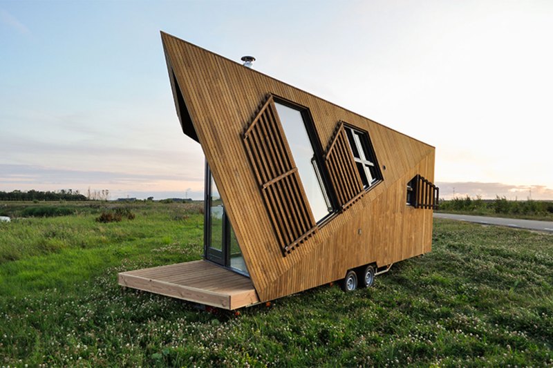
In the early days of the movement, the appeal of tiny houses was just that — they were tiny. It was new and exciting to try to figure out how to live life in less than 300 square feet. But a decade into the trend, squeezing inside of a basic box has become boring. One tiny house company in the Netherlands has brought the excitement back to going small. The sculptural Makatita Tiny House has sharp angles and an organic design that makes it stand out in the world of small structures.
Liberté Tiny Houses

Calling it the company’s “most special house to date,” the team at Liberté Tiny Houses put a lot of love into the creation of the Makatita Tiny House. Many of the brand’s previous designs featured angles, usually in the form of a sloped roof. But with Makatita, the angles took on a light of their own, defining the entire project and turning the tiny house into something beyond just a place to live. It became an architectural work of art.

Recommended Videos

Organic architecture is a tricky business. There is a challenge to balancing the design of the home with its natural surroundings while also creating a space that is tailored to the functions of its inhabitants. It’s not something that has been implemented into tiny houses very often, yet they are the perfect fit for this style – providing exactly enough space for living comfortably while creating little disturbance to the natural environment. 

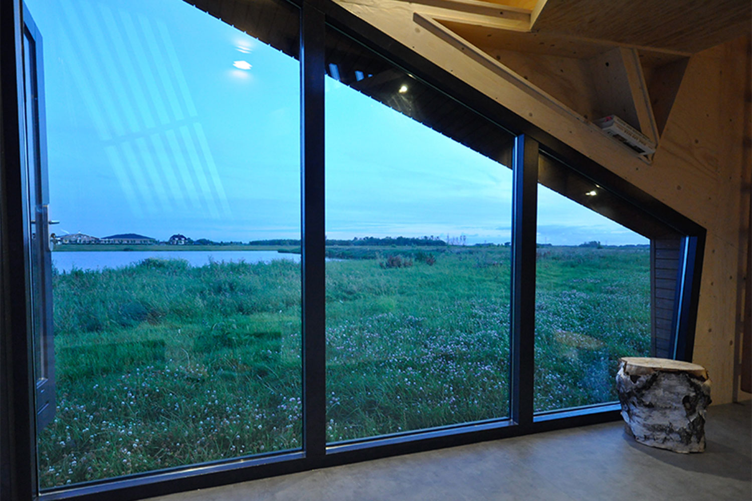
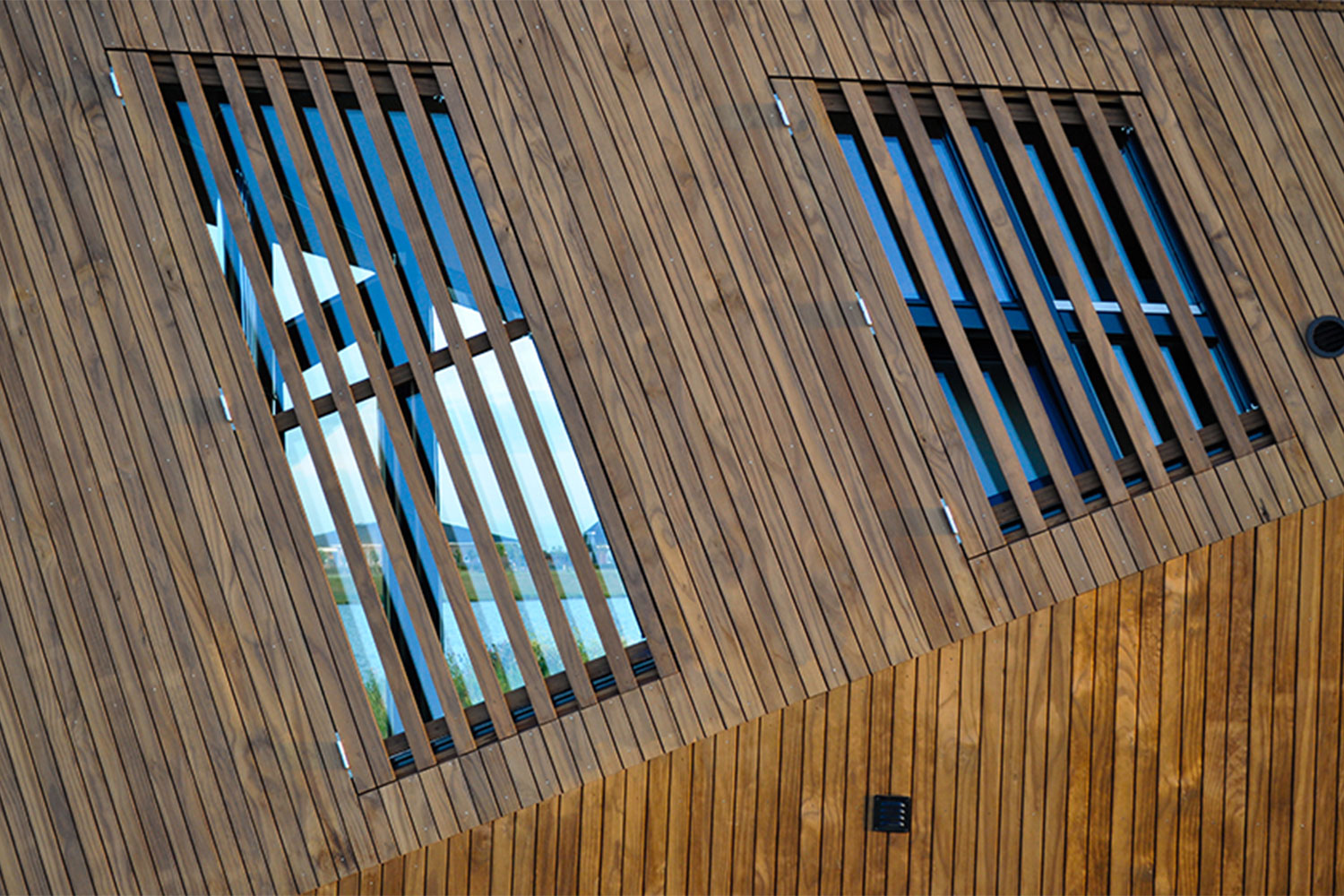
With Makatita, the team at Liberté was able to squeeze style and comfort into just 182 square feet, yet the exterior design of the home feels larger than life. The sharp angles of the wood-clad walls are like a work of art, but the structure can easily blend in with its surroundings when parked in a forest. Around one side, walls of glass let natural light fill the home while framing views of whatever wonderous landscapes happen to be outside. 

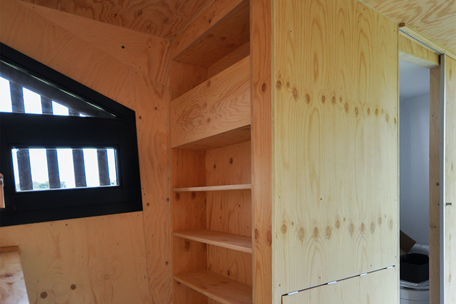
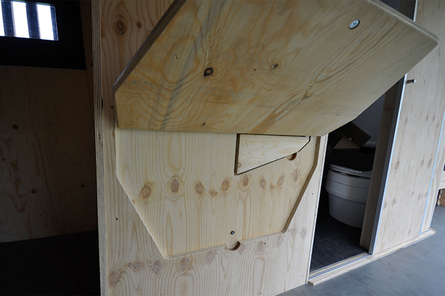
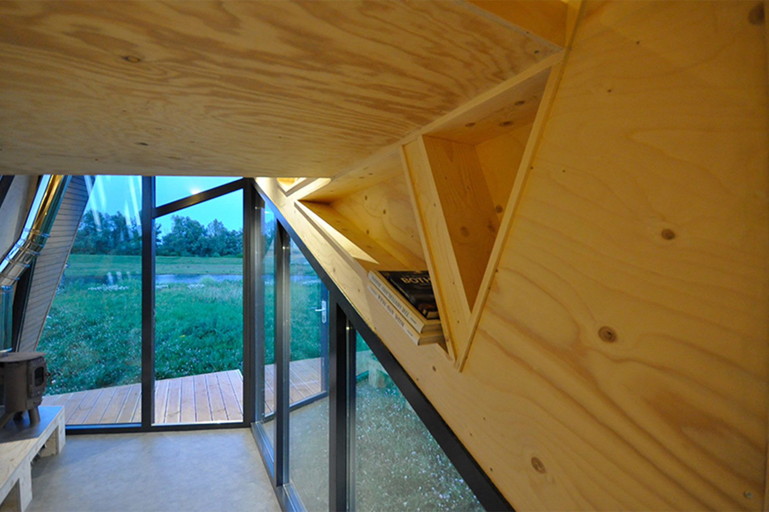
Inside, the home has only what it needs: a living space with wood-burning stove, a bathroom with shower and toilet, a kitchenette with mini, fold-out dining table, and a loft bed accessed via a built-in ladder. All of these elements were designed in an artistic way. The angles of the exterior continue inside, the wood used as the main material was left raw, and the layout of the spaces ensures that nature remains the focus by framing the outside views.  Storage spaces were even carefully designed to be little artistic moments thanks to their angular shapes. All of this set onto a towable trailer so you can change your surroundings with a simple drive to a new location.

Makatita Tiny House fully embodies everything the tiny house movement was built on: downsizing your life so that you can better appreciate the world around you. By incorporating organic architecture, Makatita brings the excitement back to living small. 
Kelsey Machado
Former Digital Trends Contributor
Kelsey is a professional interior designer with over a decade of experience in the design field. With a passion for…
Jason Statham Lives in a Surprisingly Low-Key House and Now It Could Be Yours
jason statham black house for sale 7

There aren’t many Hollywood stars as badass as Jason Statham. The action movie actor has made a name for himself by being tough and kicking bad guys’ butts over a career that has spanned nearly three decades. With the Machiavellian attitude typical of the characters he plays on screen, you would expect his house to be a brooding brutalist man cave with knives and guns hanging on the walls in place of artwork. But the down-to-earth actor actually calls an oceanside, zenful retreat home -- and now it could be yours.

Dubbed Black House, Statham’s home is currently up for sale and asking just under $20 million. It’s been his place to unwind after a day on set since 2009. Decked out in a stylish combo of mid-century modern meets cool California vibes, Black House is surprisingly bright and airy on the inside. It’s the outside that gives the home its name. 

Read more
Check Out This Dramatically Angular Glass Cabin in Norway
efjord cabin glass house norway snorre stinessen architecture 3

Imagine your ideal hideaway. Is it a lodge surrounded by mountains or a waterfront cabin? What if you didn’t have to choose? One island abode lets you take in every kind of landscape, in any season. Efjord Cabin is a year-round retreat that soaks up all of the stunning scenery Norway has to offer.

Located on the small island of Halvarøy, Efjord Cabin is the brainchild of Snorre Stinessen Architecture. With few other inhabitants and stunning vistas all around, Stinessen was able to create a one-of-a-kind, year-round glass cabin for his clients. A natural ledge provided the perfect spot to position the home, taking in two of Norway’s best climbing peaks to the south and a view of a fjord to the west. A ridge in the terrain to the east helps protect the cabin from harsh weather. This spot also lets the home take advantage of the sun throughout the day - warming rooms and filling them with natural light. Using a design that visually alternates between opening up or closing off the outside, Stinessen provided his clients with panoramic views while also offering privacy and the feeling of seclusion that they wanted.

Read more
A Renovation Turned This Dreary Space Into a Stylish Urban Abode
olivier nelson residence nature humaine architecture design 7

If you’ve ever strolled the streets of Montreal, you know it’s a city of contradictions. While the downtown business district is packed with modern skyscrapers lining the St. Lawrence River, stepping into the surrounding historic neighborhoods is like traveling back in time to 1800s France. Narrow streets are lined with little shops, quaint cafes, and traditional European-style row houses. In this old-meets-new city, one rundown duplex received a thoroughly contemporary makeover that makes it stand out from its neighbors yet perfectly match the vibe of Montreal.

Renovated in 2019 by the team at Nature Humaine Architecture and Design, the Olivier Nelson Residence was originally a duplex row house. Sandwiched between two other homes, the interior was dark, almost cave-like, the layout wasn’t functional, and the design was dated. The team at Nature Humaine turned the structure into a brightly lit single-family home.

Read more