In crowded metropolitan cities, it can be hard to find a place to escape. Often, connecting with nature means heading outside of urban areas in order to be among the trees. This is especially true in Mexico City, where overcrowding and tightly packed houses leave little room for luxuries like backyards. However, in the exclusive Jardines del Pedregal neighborhood, one home was blessed with plenty of trees and lush vegetation, making escaping to nature as easy as stepping outside.
The work of the folks at Pérez Palacios Arquitectos Asociados (PPAA), Lluvia Residence sits in an urban oasis — the site is filled with trees, greenery, and natural rock formations. It’s a truly unique landscape for crowded Mexico City. Knowing how special the site was, the team at PPAA devised a design that opened up to nature, cutting away forms and building a creative footprint to preserve as many trees as possible.

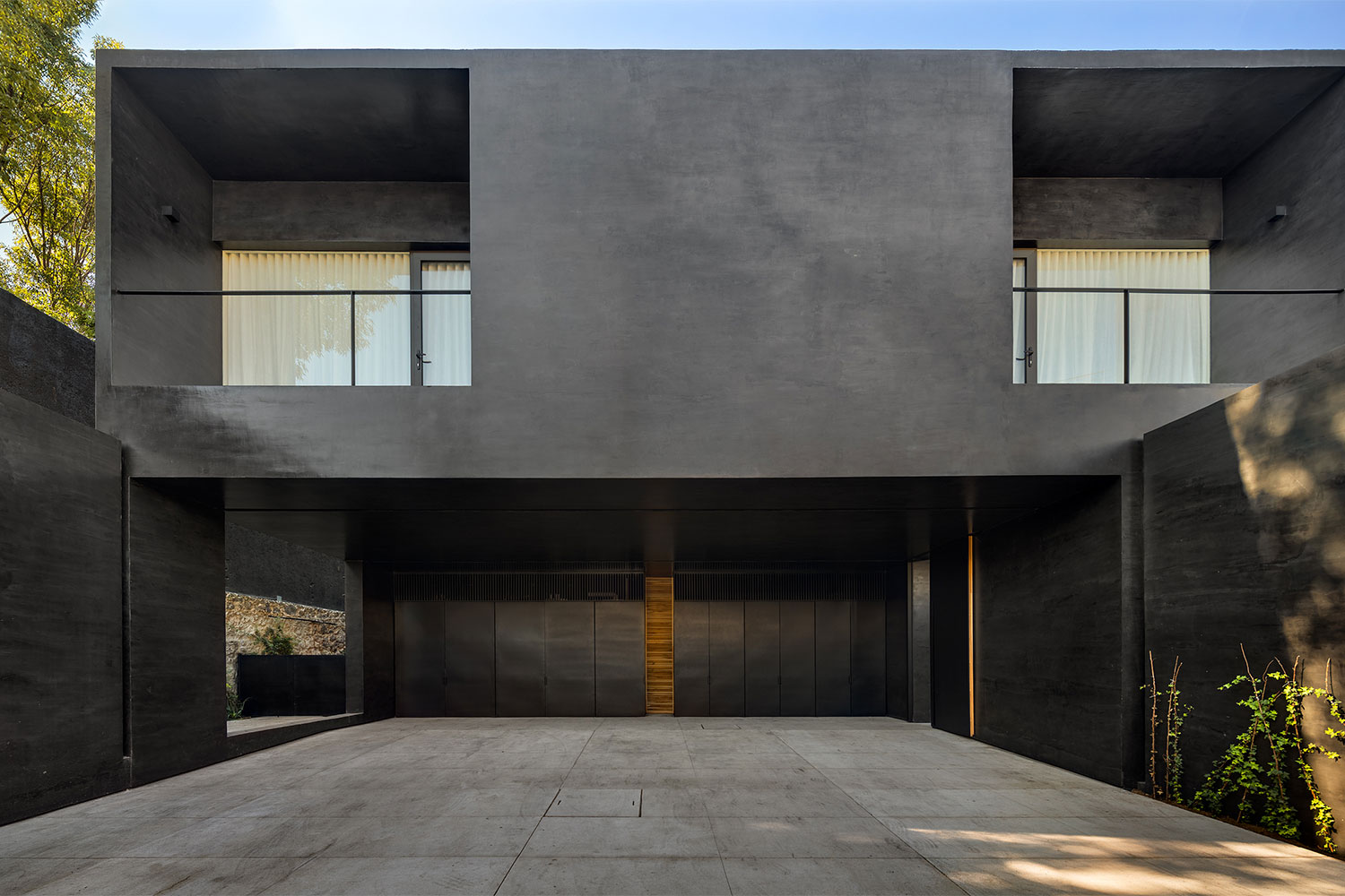
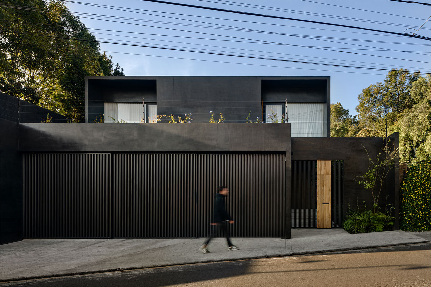
The name Lluvia translates to “rain,” and this is only the first way the home was inspired by nature. The exterior of the home is a deep charcoal gray concrete. It mimics the color of the sky right before a big storm is about to hit. This dark color also creates the perfect background to showcase the surrounding foliage, making the greens of the ivy and yellows of the flowers stand out.
At the front of the home, flowering vines cover privacy walls that flank the entrance. The dark concrete form of the home is punctuated with dark stained wood-slat shutters on windows and a wooden front door. On the second floor, two balcony spaces were cut into the home rather than protruding out. This allows the balconies to be sheltered from the elements while still providing exterior spaces where residents can relax in the evening.
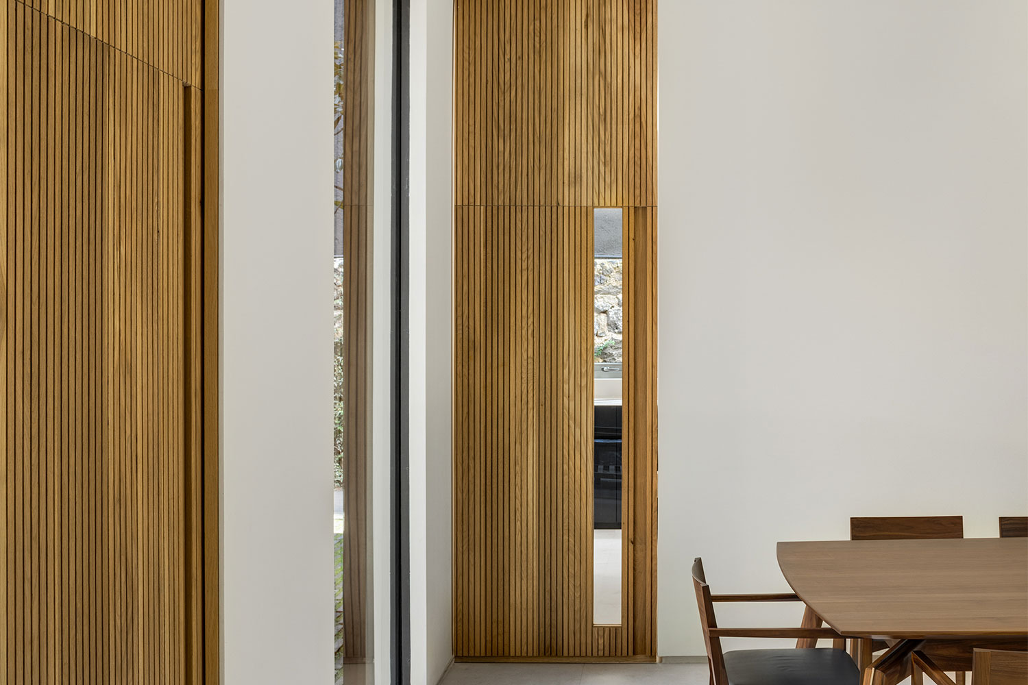
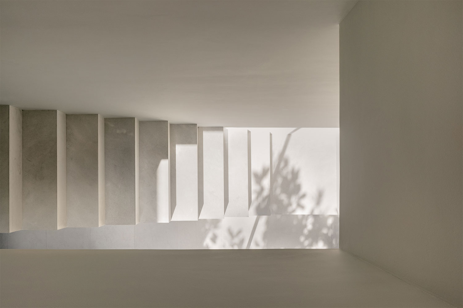
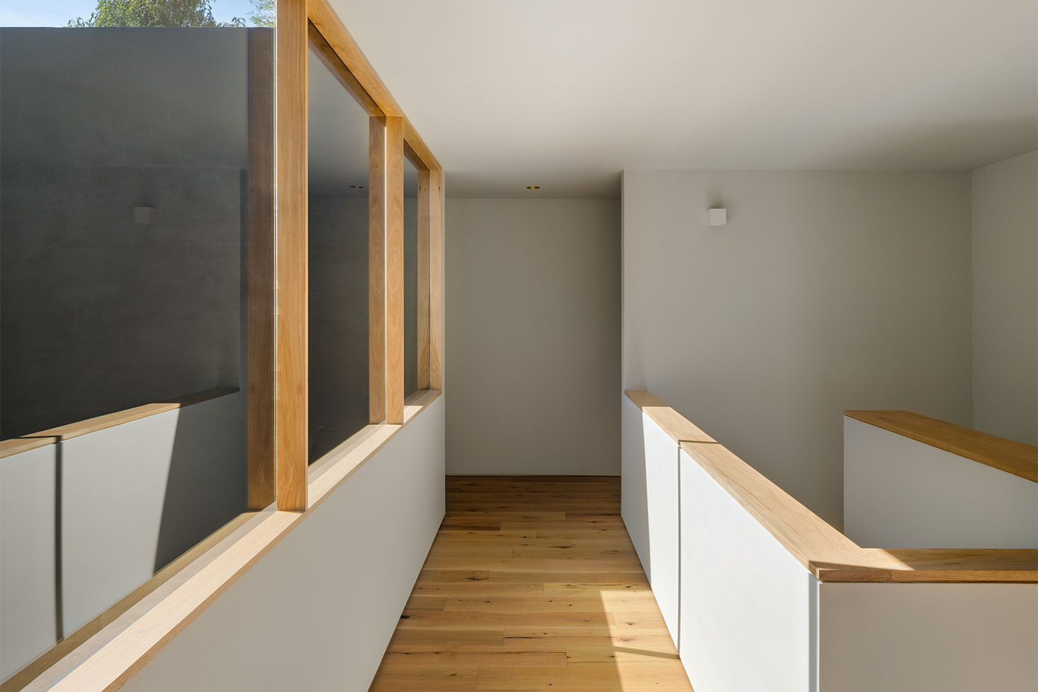
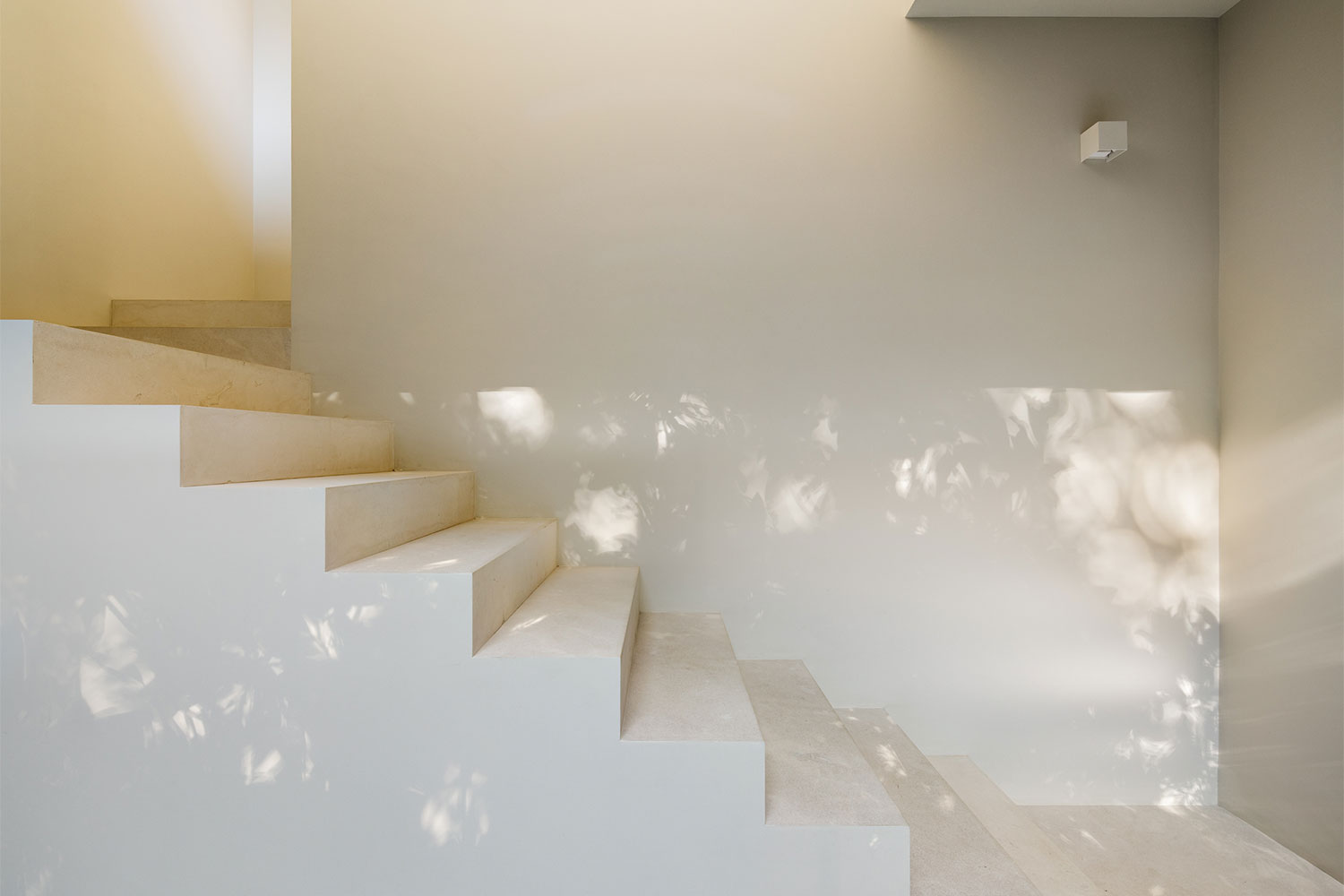
Inside, the home is a sharp contrast from the exterior. One of the main goals of PPAA was to create a welcoming space that felt wrapped in light. This was achieved thanks to large windows thoughtfully placed to fill the interior with natural light. Bright white walls and ceilings and beige tile floors help bounce light around each room, ensuring even hidden corners get hit with natural light during the day. The wooden accents continue inside but this time they are a lighter tone, balanced with the bright white finish of the other interior surfaces. The style of the home is contemporary minimalist; simple furnishings and clean lines ensure the focus stays on the natural beauty outside.
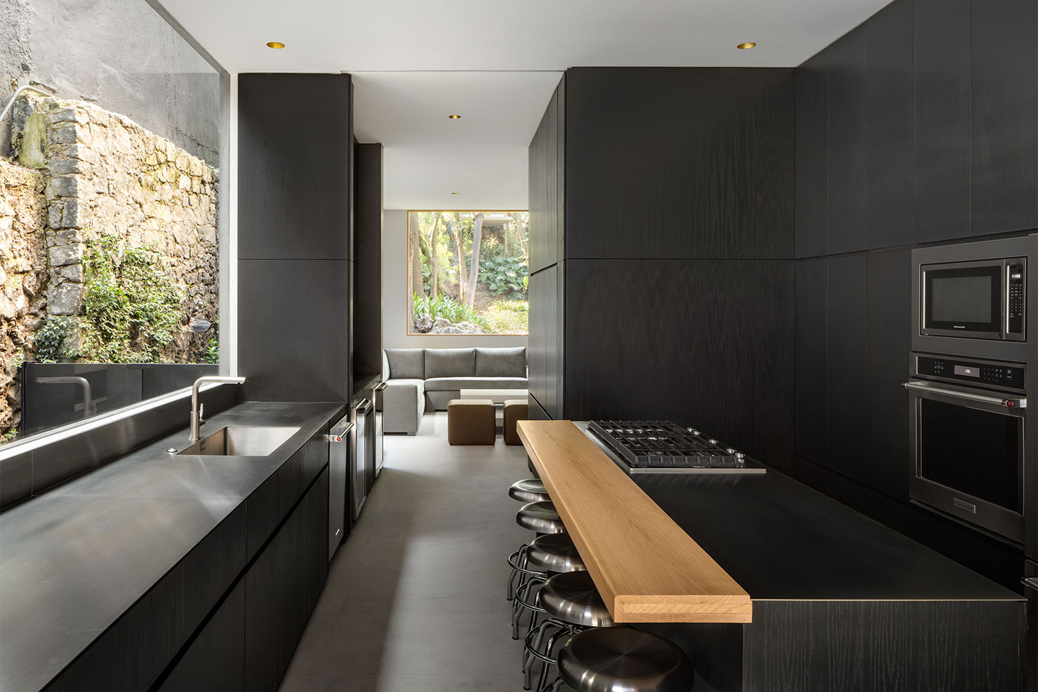
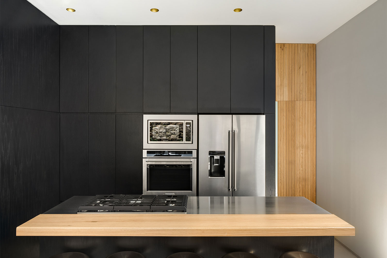
The kitchen is the standout room in Lluvia. Unlike all of the other spaces, this room is ultra-contemporary with all-black cabinetry, appliances, and countertops. A simple strip of blonde wood designates the breakfast bar of the island — the only pop of color in the room. But thanks to a wall of glass, the kitchen is just as bright and welcoming as the rest of the home.
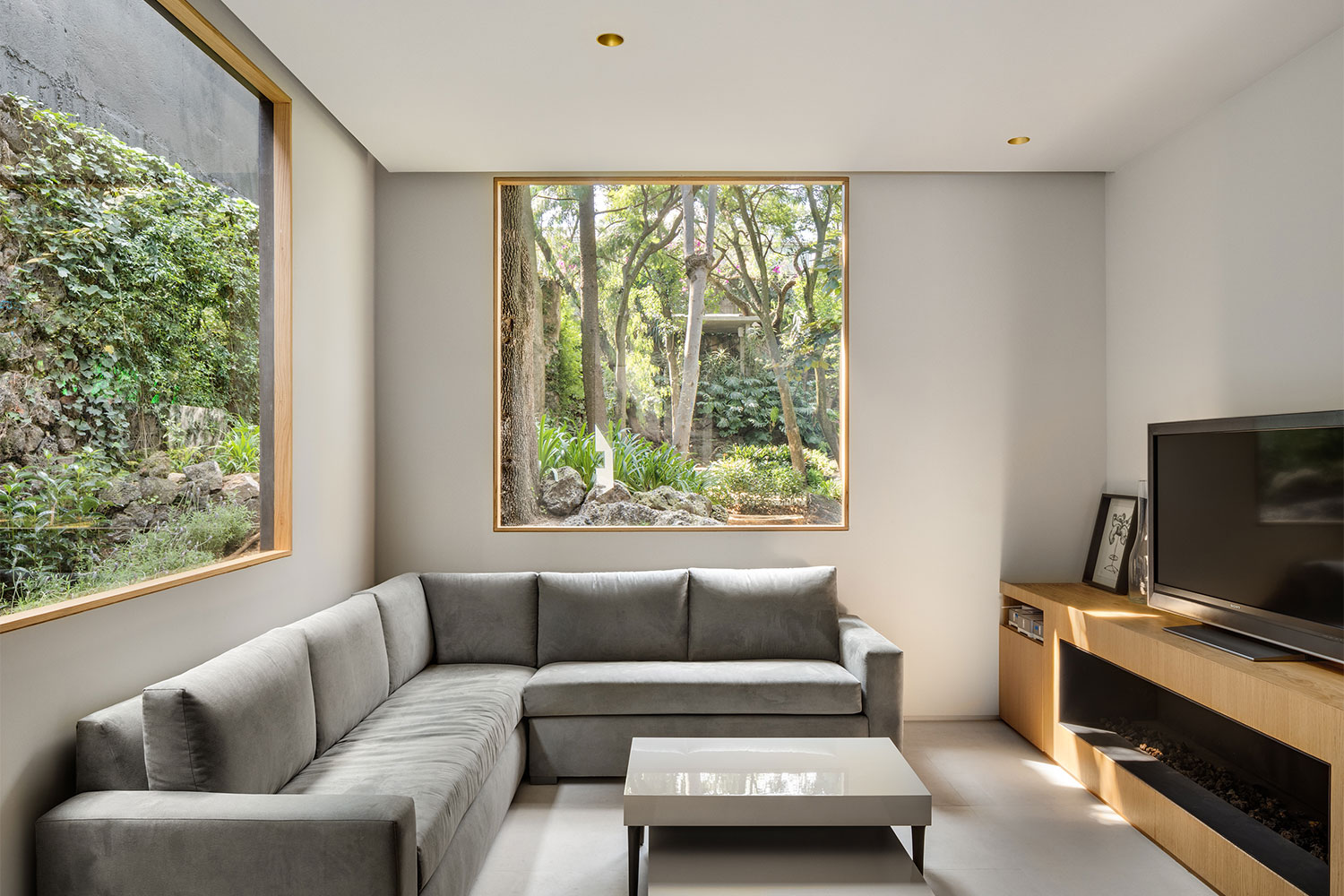
Off of the kitchen is the living room. The furniture may be set up facing the television, but it’s the view to the backyard garden that makes this space so special. Large corner windows frame the trees and rock formations outside, creating a sensation of being in a secluded forest while relaxing on the sofa. It’s these moments that PPAA focused on when designing Lluvia Residence.
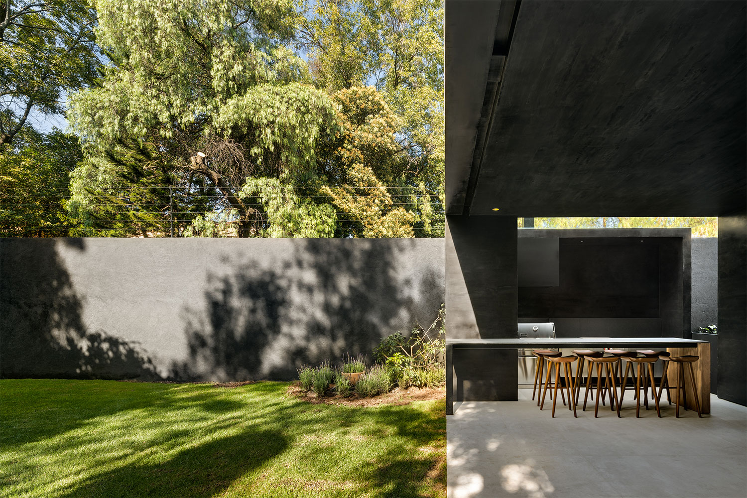
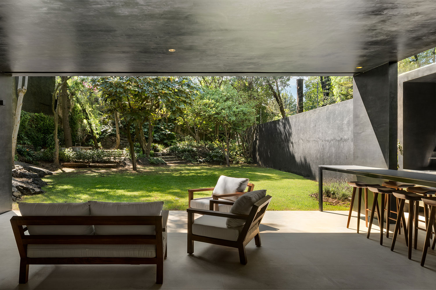
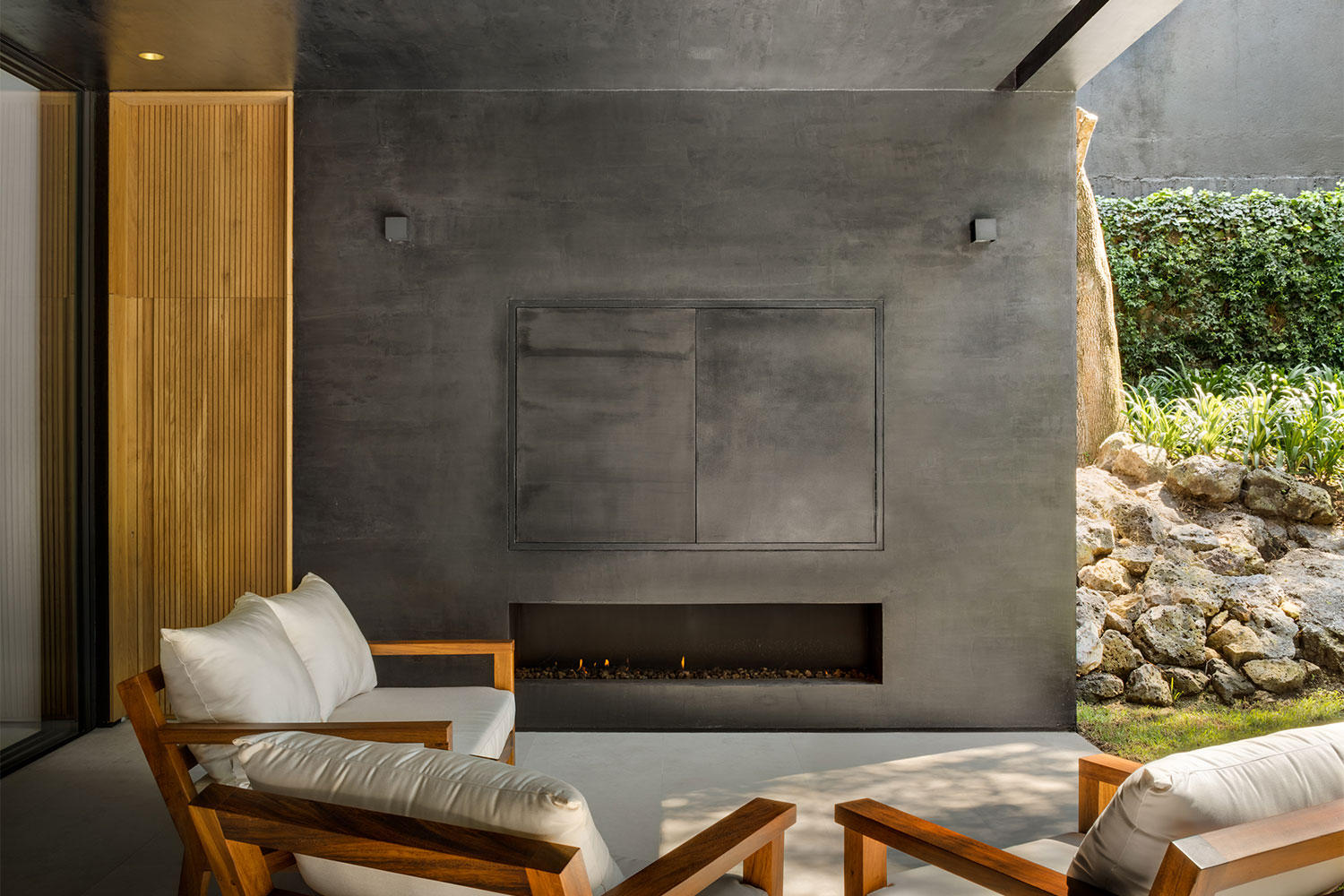
Heading to the back of the home, the cutaway forms continue. A U-shaped courtyard juts into the home, preserving a tree that was already on site. The back patio is cut into the home, similar to the second-floor balconies. This creates a sheltered space for the outdoor kitchen, dining, and living areas.
Lluvia Residence sits on a long, narrow lot. On the front half, the home spreads out over 6,500 square feet on two floors, while the back half of the lot was designated for the garden. Here a hidden deck among the trees and rock formations creates the ultimate urban oasis — surrounded by nature, you forget you are in the most populous city in all of North America.
