If your ideal home is a relaxing space with bright white walls, massive windows, and crisp, clean lines, minimalism may be the style that best suits you. With little ornamentation, the idea behind minimalism is to create a calm, uncluttered space that lets you unwind after a hectic day and reconnect with nature while enjoying the finer things in life. Read on to learn how to cultivate a stylishly simple minimalist home.
Principles
Minimalism first began in the 1960s as an extension of the midcentury modern style. Midcentury modern architects and designers took the idea of reduced ornamentation and simple lines in both furnishings and architecture to its extreme. While midcentury modern saw hints of influence from Japanese aesthetics, minimalism went even further, fully embracing the philosophy that simplicity is the ultimate way to connect with nature.
Contemporary minimalism has seen a shift toward all-white structures dotted with deep black accents or incorporating natural elements like wood and stone. Silicon Valley has embraced tech-centric minimalism with crisp white interiors, white furnishings, and even white electronics designed to be a blank slate that lets creativity blossom.
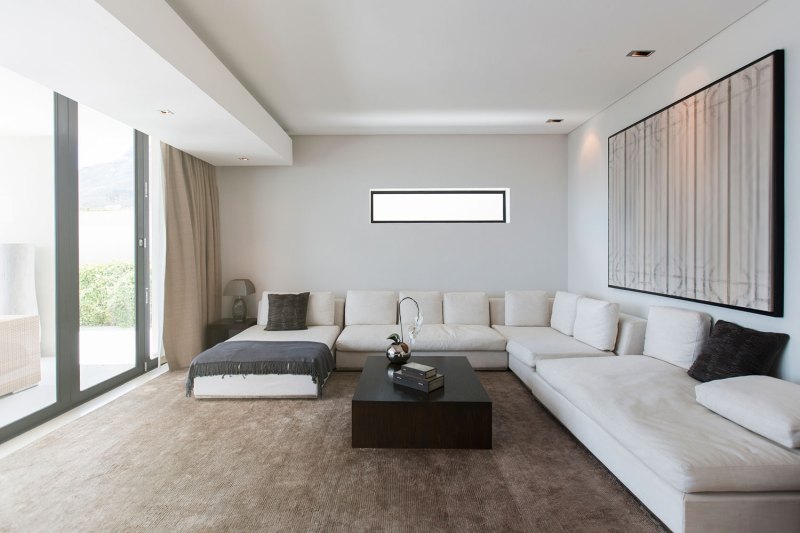
This idea of simple spaces doesn’t mean minimalism is sterile. Instead, the few pieces that do adorn a room are often high-end and visually striking. A clean-lined sofa becomes art when it is one of the only pieces in the room. And relaxing on the sofa, in an unadorned space, while gazing out the window, allows for a connection to nature to be developed. This has long been a guiding principle of Japanese design — creating a space that lets nature be number one. In design, it’s called “quiet” — a room with no architectural ornamentation and little to no artwork reduces visual “noise,” making it easier to meditate and focus your mind.
Architecture
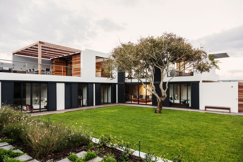
Minimalist architecture is not what you might expect. All this talk of simplicity may have you picturing a basic, boring box of a house. But that’s far from the case. Remember, minimalism was built on the back of midcentury modern. Avant-garde designs were just coming into play when minimalism first took hold. So while some iconic designs like the Farnsworth House (a design that has been called “modernist minimalism”) are in essence white boxes, most true minimalist houses are visually striking from the outside.

Bright white may be the primary tone for the exterior of minimalist homes, but these homes are often accented with black or natural wood elements to create visual contrast. The square box form becomes playful when laid out in a unique way or stacked off-center. A flat roofline goes from basic to exciting when cantilevered out to create an awning for an outdoor patio or through the use of a change in materials, such as an exotic wood pergola.
Because a connection to nature is such a key element of the minimalist philosophy, careful thought is put into the exterior spaces of the home. Often created to feel like a luxury getaway right in your own backyard, these outdoor rooms are perfectly positioned to make the most of whatever view the home has to offer. There are clearly defined zones that offer multiple ways to enjoy the outdoors, including dining rooms, sitting areas, and a space for solitary contemplation such as a sunbed or single lounge chair looking out to nature.

Furniture, Colors, Patterns
The ideal minimalist home should feel serene. White is the primary (and sometimes only) color, but this doesn’t mean spaces feel stark. Instead, the white creates a blank slate background that allows your mind to declutter from your hectic life. Furnishings continue the theme of straight lines with no ornamentation, but they are high-end pieces made for comfort and relaxation. You’ll also find some minimalist pieces carry over the simple curves from midcentury modern designs. Blending the two styles can bring interesting visual contrast to the space and break up the monotony of straight lines.

While a white color palette may sound boring, it can be refined and luxurious when paired with the right accents. Try a single, oversized piece of artwork on the wall above the sofa. Accent the white walls with exotic wood flooring. Bring in black accent pieces like a glass block accent table or lighting with black shades. These simple touches will pop against the bright white of the rest of the space, while not creating visual clutter. Ideally, you have a home full of massive windows that let you gaze out to nature to unwind, but if not, bring in a few carefully selected potted plants to add a touch of life to the space.

Rather than adding patterns to your space, try adding texture. Minimalist spaces work best when multiple textures are combined, like a leather sofa, glass coffee table, and a soft, plush area rug on wood floors. If you want a true white-on-white space, these textures will add enough visual interest to keep the design feeling luxurious.
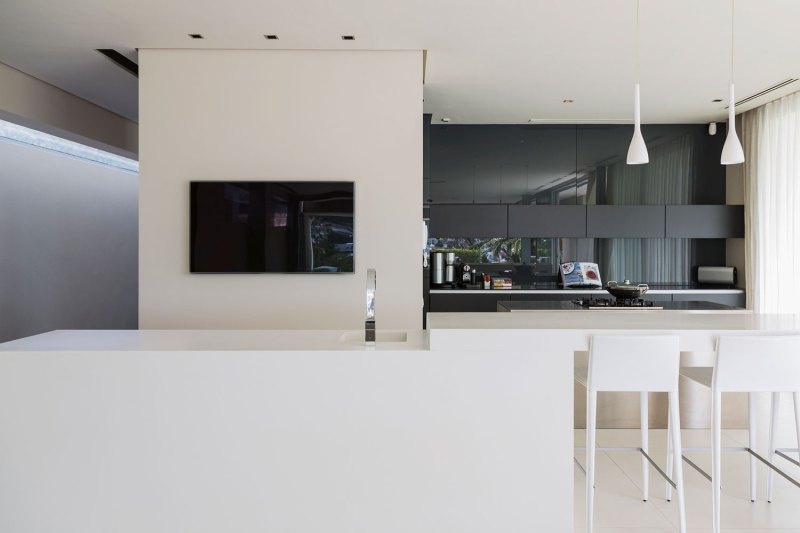
Surprisingly, the kitchen is the room that often sees some excitement in a minimalist home. This is a chance to add texture and layers thanks to creative countertop materials and shiny appliances. An all-white island will pop against a wall of black cabinetry. Add in some straight-line drawer pulls in polished stainless steel to complete the look and bam, your kitchen just became the star of the show. But when you understand minimalist philosophy, that makes sense. All other rooms in the home are built for relaxation and clearing your mind. The kitchen of a minimalist home is exciting because meal prep is a chance to have some fun and bring bursts of color into the room thanks to the fresh fruits and veggies you’ll be cooking with.

Notables
Because minimalism was an extension of what began with the midcentury modern movement, there’s a lot of crossover between the two styles. Later works by architects and designers like Ludwig Mies van der Rohe and Le Corbusier fall under the minimalist umbrella. The entire movement can be summed up with Mies van der Rohe’s famous motto “less is more.”
But minimalism can’t be talked about without highlighting the star of the style, Tadao Ando. He was the first to bring contemporary Japanese architecture into the mainstream and in doing so, gave the rest of the world insight into just how beautiful simplicity can be. He also showed us that white isn’t the be-all and end-all of minimalist style, often incorporating light gray concrete into his designs. Above all, Ando exemplified the idea that architecture is an extension of nature, which, combined with the “less is more” motto, serves as the founding principle of the minimalist movement.
Where To Shop
Budget
Style, comfort, and affordability all come together in Ikea’s Söderhamn series. Available in dark gray or crisp white, the seating line features the classic clean lines of minimalism. The pieces can be combined to create a custom sectional or stand on their own as a unique statement piece. For a more Japanese minimalist look, Ikea’s Nordkisa series in bamboo will bring a natural touch to your space.
Middle of the Line
Structube is a hidden secret in the design world that won’t be a secret much longer. While the company’s pieces all fall in the “middle of the line” price range, a look through its sales section shows off some exciting budget finds as well. The company offers a range of styles, so shop by color (black or white) to see its selection of minimalist pieces.
High-End
Comfortable seating is an important part of creating a minimalist space. Muuto has carefully curated home furnishings from a range of designers, offering the latest styles. Its Outline series is the perfect “straight lines meet cozy comfort” you need to create a minimalist home. And to finish out your look, Studio Cofield offers wonderfully minimalist accessories that are all handmade.
For more home inspiration, check out our modern Japanese style guide.


