If you want to own a home in the city, often time a row house is your only option. There are plenty of positives to these connected houses. A stronger sense of community arises when you share a wall with your neighbor. The location can’t be beat — walking to your favorite cafe is better than having to hop in the car and drive. You get the best of city life without feeling crammed into a tiny high rise apartment. And having an actual backyard in the city is pretty sweet.
But there is a big downside: renovating a row house is a challenge you don’t want to tackle alone. Luckily for one family in Montreal, the team members at Nature Humaine are experts at turning a simple space into a stylish home that makes you forget there are neighbors on either side.

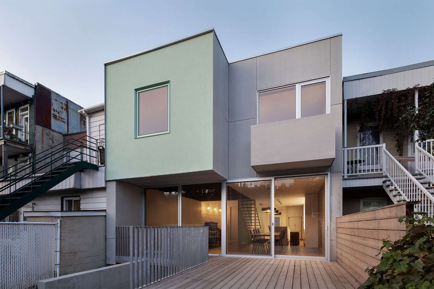
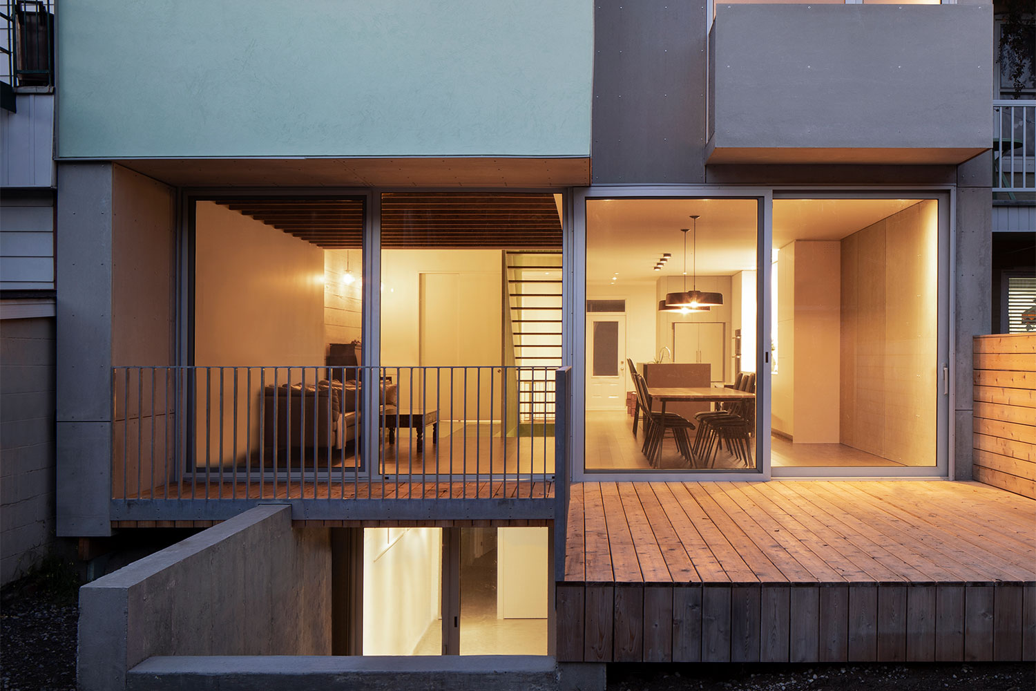
Located in the Rosemont-La Petite-Patrie borough of Montreal, Victoria Residence was a renovation project that saw a complete redesign, taking the traditional townhouse and transforming it into a light-filled contemporary abode highlighted by three distinct architectural forms. The addition of these forms, plus bright pops of color, bridge the gap between the traditional architectural structure and the contemporary interior design of the home.
Starting with the entrance, a second-floor balcony was added onto the facade of the home. It helps Victoria Residence stand out from the monotony of the endless wall of brick that makes up the front of the row houses. Highlighted by the use of a light sage green railing, the balcony stands out as an intriguing visual element while also hinting at the fun surprise waiting inside.

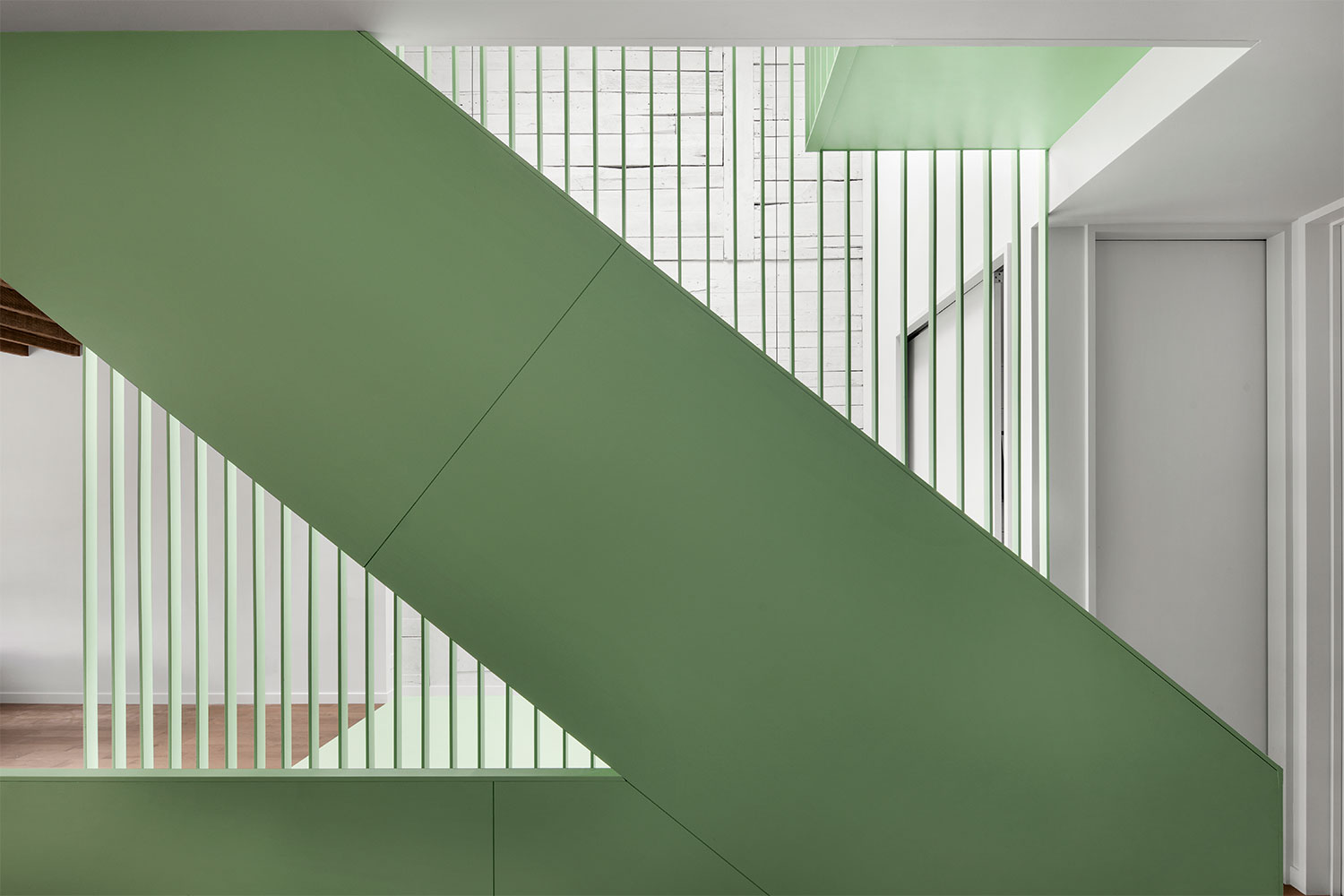
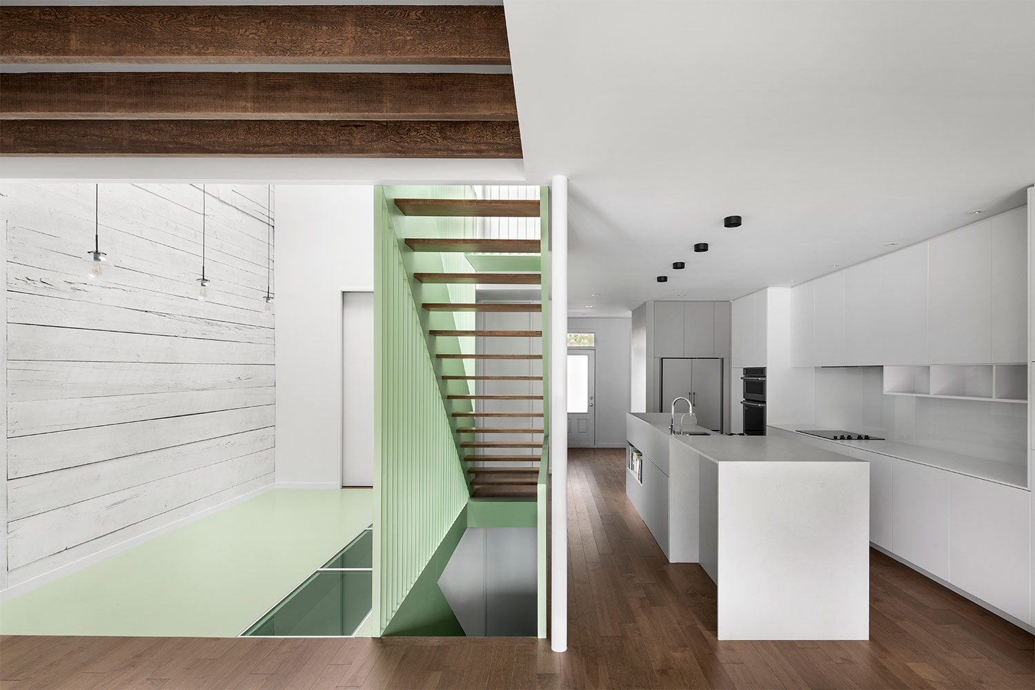
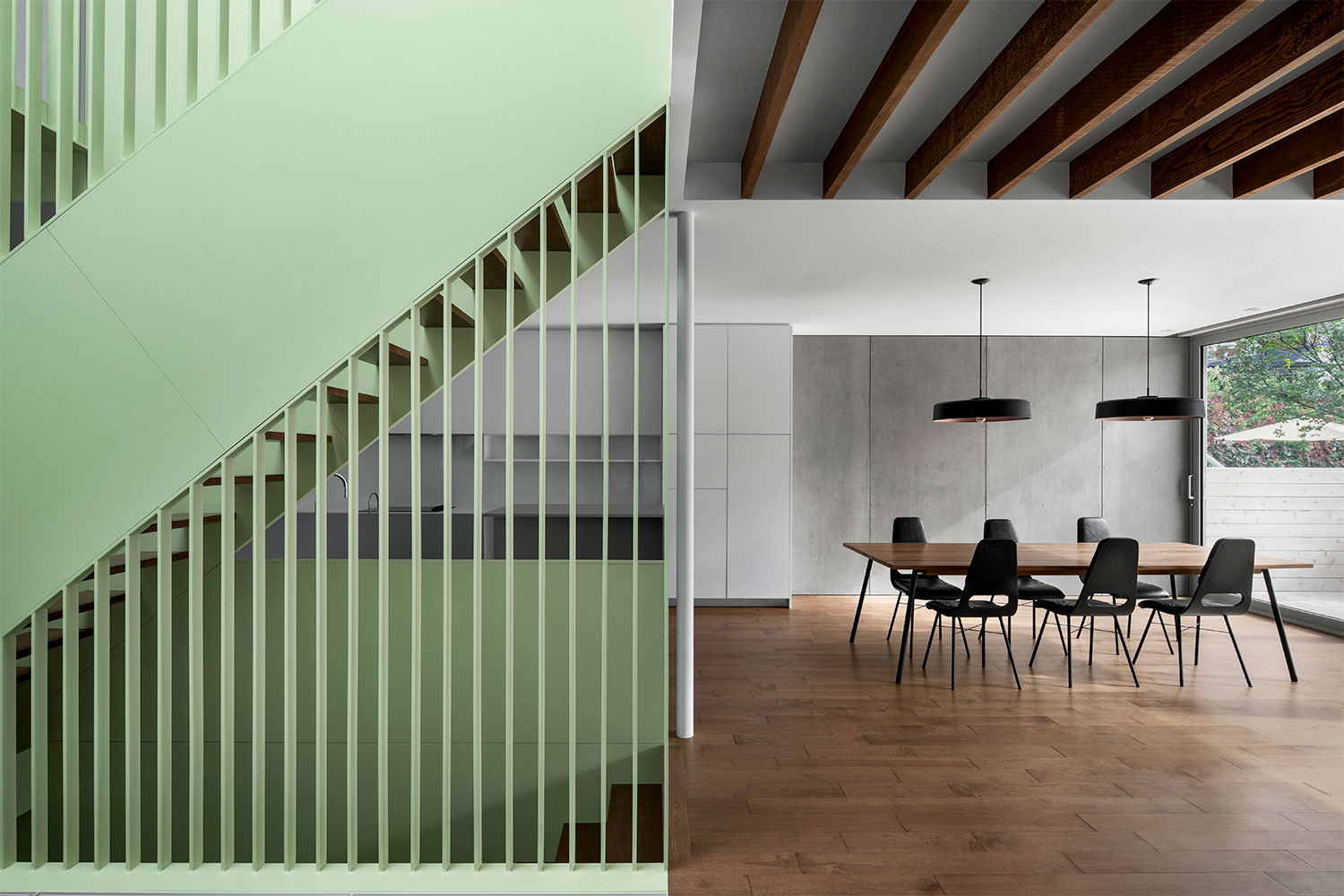
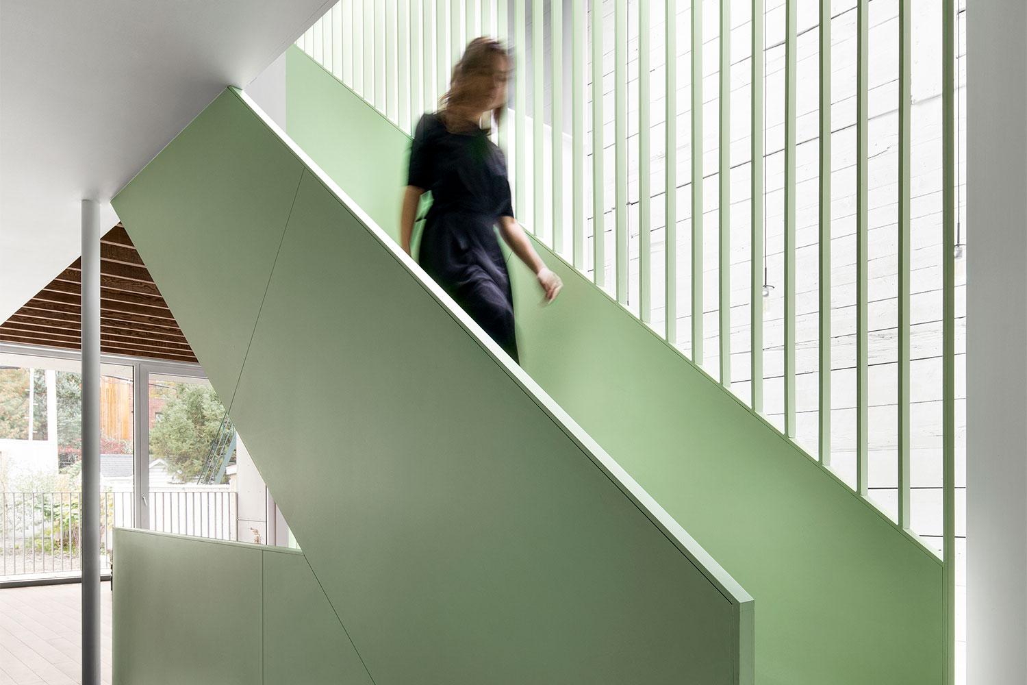
Upon entering Victoria Residence, you are greeted by an ultra-contemporary, white-walled home. Interesting elements were pulled in to complement the white walls and ceilings, like the continuation of the exterior fibrocement panels into the dining area, the exposed wood ceiling beams, and the wood plank flooring. It’s a crisp, clean, and warm take on minimalist style. But in reality, all of these neutral finishes are simply the backdrop for the home’s showstopper: a central steel staircase painted a bright green.
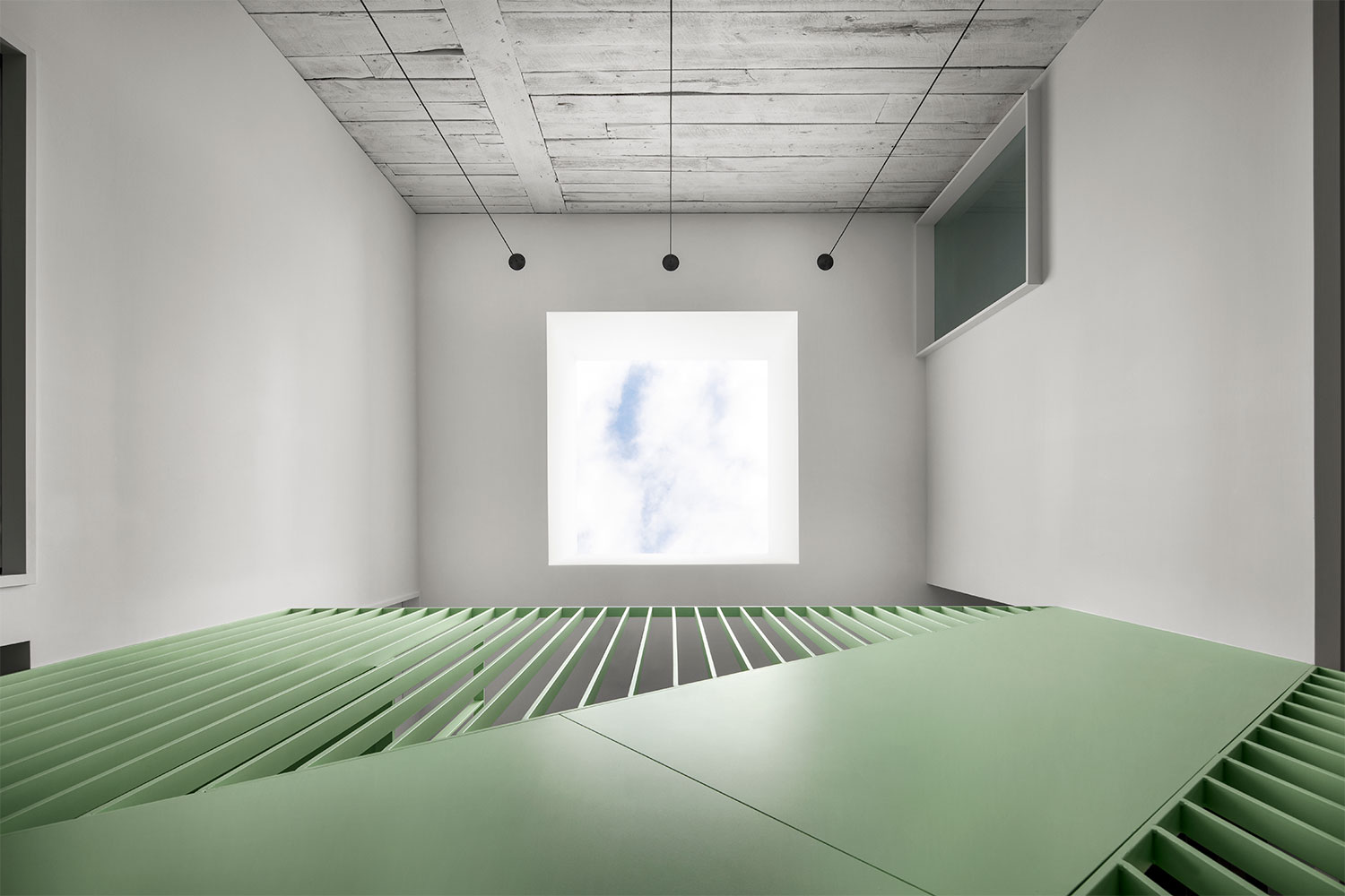
The second architectural form to be added in the redesign of Victoria Residence, the central staircase is the most important feature. It not only creates a whimsical focal point, it defines the layout of the spaces, and creates a way to let natural light into the center of the home — typically the darkest spot in a row house.
Light filters down to every level of the home thanks to the clever solution of placing windows in the floor. The central staircase form was accented by the addition of a large skylight placed in the ceiling. But that light can only reach down so far — the first floor still would have been in the dark. Instead, the folks at Nature Humaine boldly placed windows in the floor next to the staircase, letting that natural light hit the lowest level. It’s a quirky touch that beckons the brave to walk across and glimpse down below.
The final form added onto the home was a bump-out at the back that became the daughter’s bedroom. It’s another juxtaposition between old and new, with the front of the home maintaining its traditional look while the back gets a modern makeover thanks to the block shape of the addition. Visually balanced by a balcony added onto the master bedroom, the bump-out was finished in the same fibrocement as the home’s facade but in a light green shade to complement the bold staircase inside.

Next to the daughter’s bedroom is a bathroom that was created with kids in mind. Surrounded in bright, sunshine yellow tiles, the tub is the clear focal point of this otherwise all-white bathroom. Playful yellow towel hooks were added to one wall — set low for easy reach. To further wash the room in brightness, a window was added above the toilet that looks into the stair vestibule. This lets natural light in from the skylight above making this space one of the happiest rooms in the whole house.
The end result is that Victoria Residence shows us how austere minimalism can be elevated by injecting a bit of fun into the space. The bold color pops of this home are just the touch of whimsy it needed.
