If you’ve ever strolled the streets of Montreal, you know it’s a city of contradictions. While the downtown business district is packed with modern skyscrapers lining the St. Lawrence River, stepping into the surrounding historic neighborhoods is like traveling back in time to 1800s France. Narrow streets are lined with little shops, quaint cafes, and traditional European-style row houses. In this old-meets-new city, one rundown duplex received a thoroughly contemporary makeover that makes it stand out from its neighbors yet perfectly match the vibe of Montreal.

Renovated in 2019 by the team at Nature Humaine Architecture and Design, the Olivier Nelson Residence was originally a duplex row house. Sandwiched between two other homes, the interior was dark, almost cave-like, the layout wasn’t functional, and the design was dated. The team at Nature Humaine turned the structure into a brightly lit single-family home.

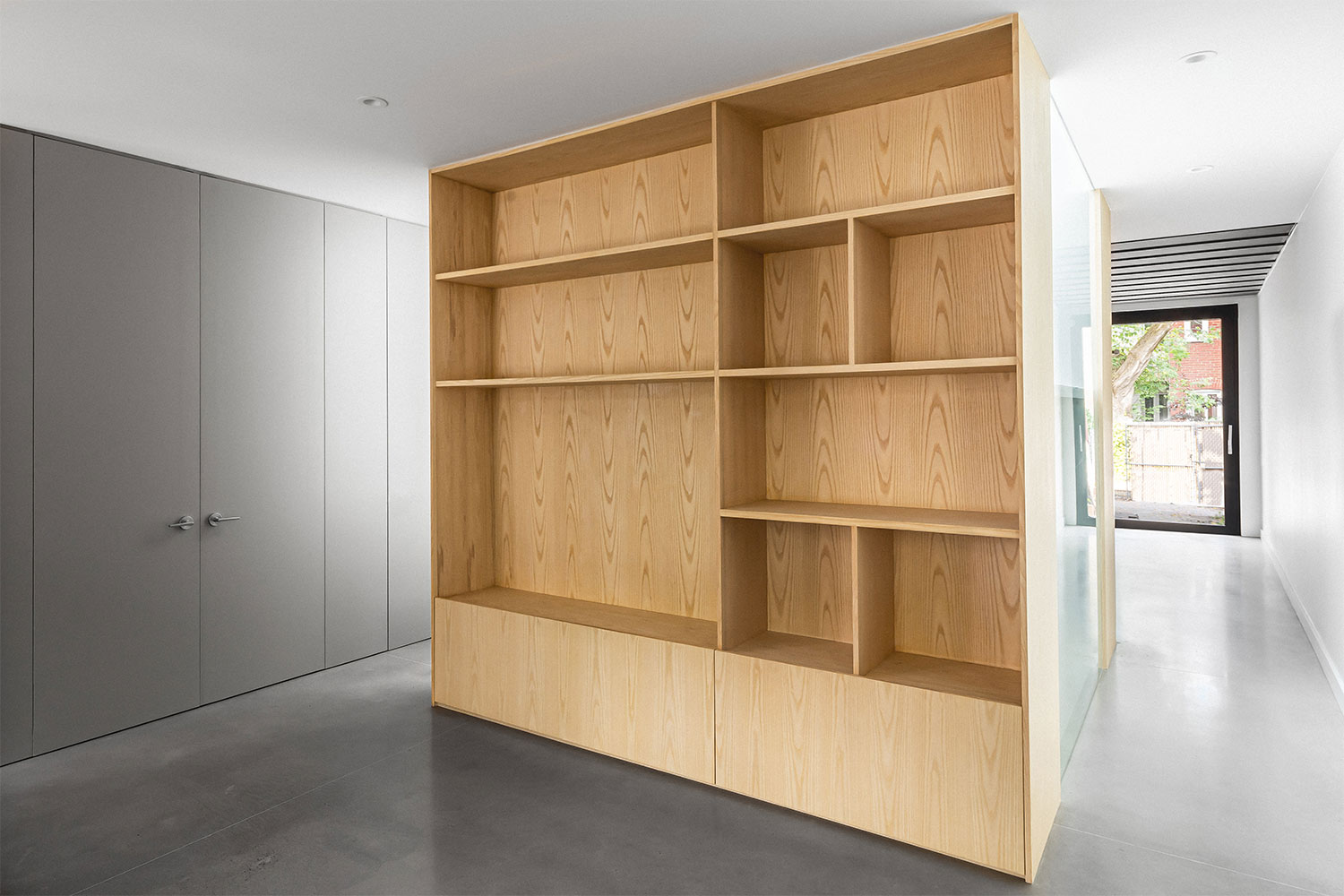
Focusing on an ultra-minimalist approach, the home is finished in a neutral color palette of grays and white inside and out. On the ground level, poured concrete flooring matches the gray, painted, built-in cabinetry that runs along one wall. The cabinets continue into the kitchen and are accented by stainless steel appliances and a matte black island. At the front and back of the home, large windows and sliding glass doors were installed to let in as much natural light as possible. Bright white walls help bounce the light around and highlight the architectural beauty of the central staircase, a major focal point of the design.

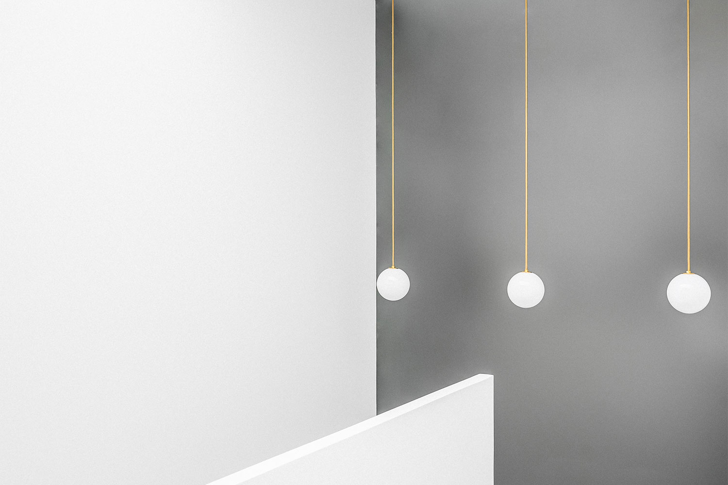
Designed to anchor the home, the central staircase helps direct traffic flows. On the second floor, the staircase acts as a divider between the master suite and the combination guest room/office. Brightly lit from above, the white paint combined with the open-tread design of the stairs lets light filter down to the hallway that connects the living room and kitchen on the first floor.
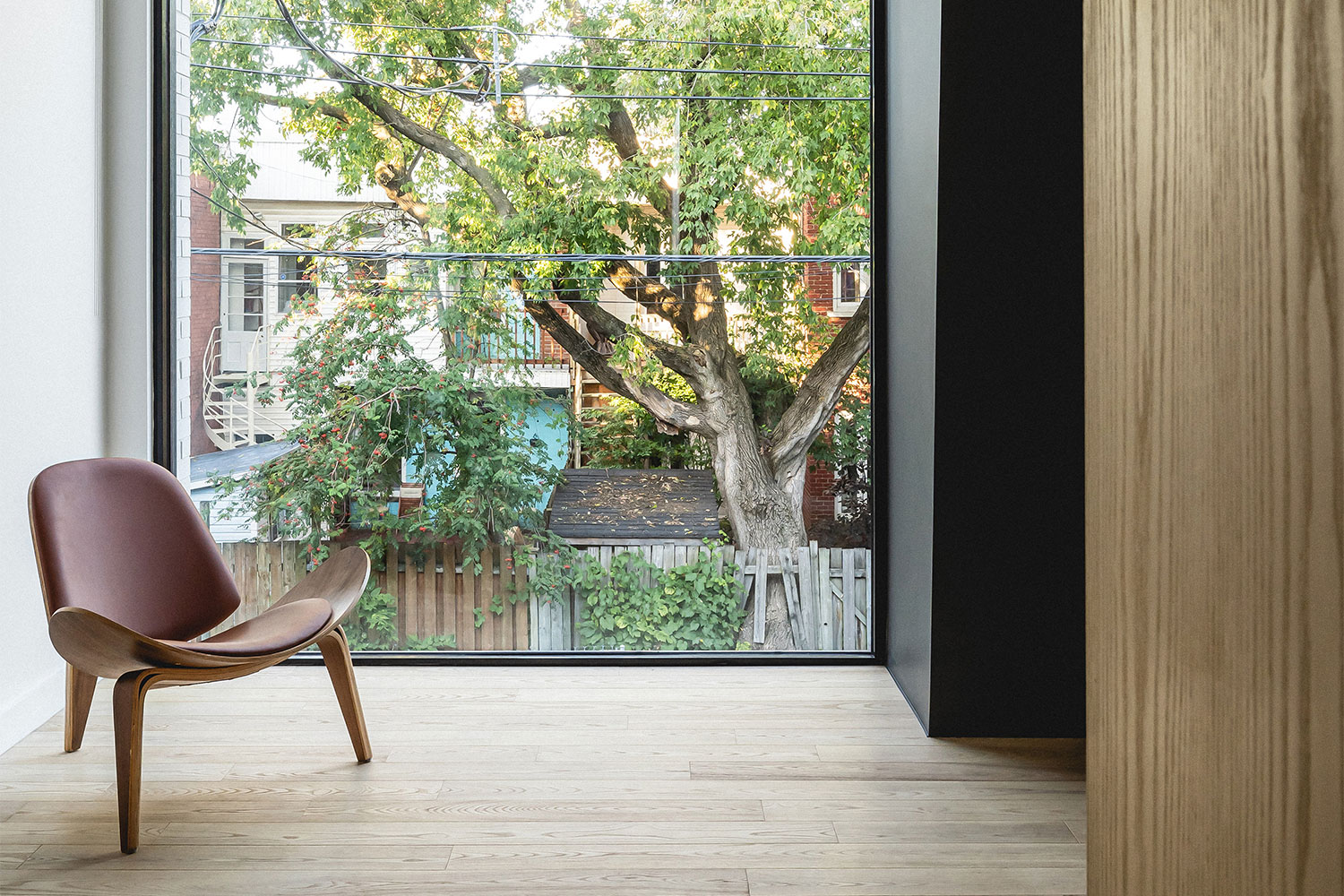
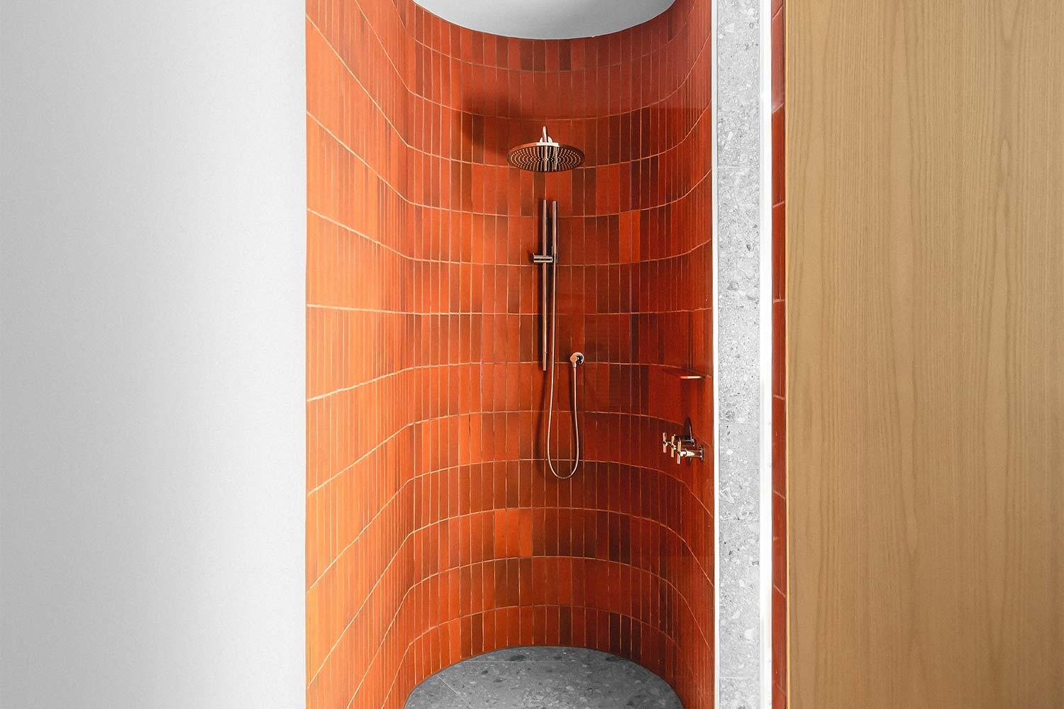
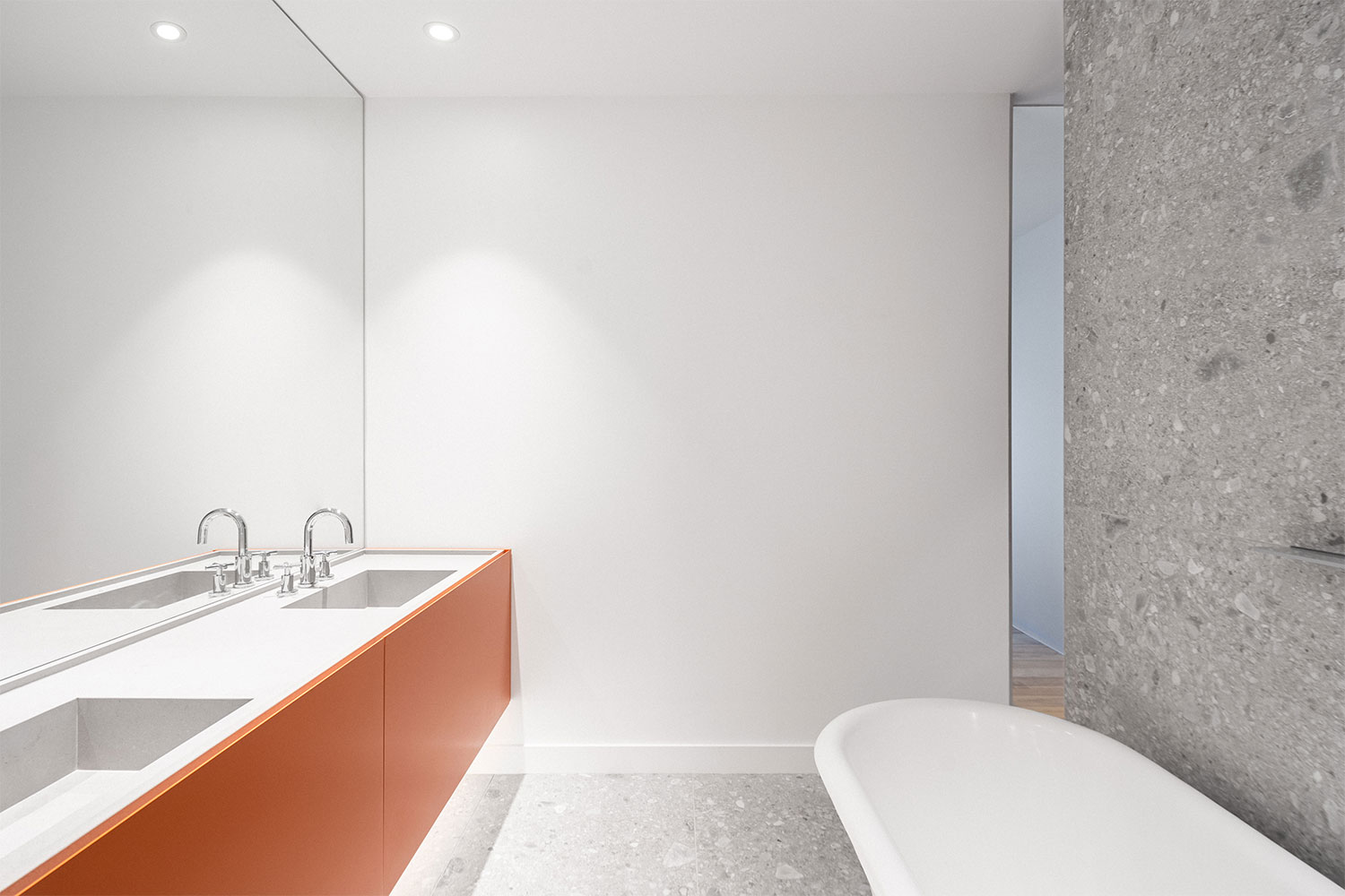
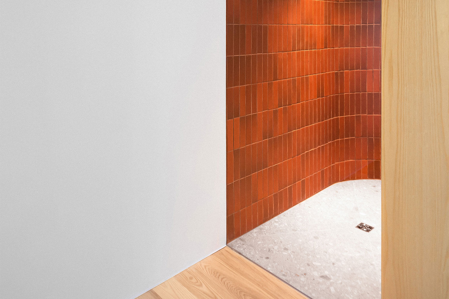
Natural wood elements like the white ash flooring on the second level and the built-in wood shelving on the first floor help to add a touch of warmth to the space. The only pop of color comes from the orange tile and the bright orange floating vanity used in the master bathroom.
Outside, the minimalist aesthetic continues. Clad in dark fibro-cement panels, a striking architectural design was incorporated to add visual interest at the back of the home. Intended to look like the roof was folding down, the panels angle inward and then out again, with the dark color “wrapping” around to become the ceiling above the dining room inside. It’s a playful element that still keeps within the minimalist approach used throughout the home.

The renovation done by Nature Humaine is certainly a stark difference from the original, but that’s what makes it so extraordinary. The team was able to take a space that wouldn’t have received a second look and turn in into a minimalist showpiece that’s the star of the neighborhood.
