Øksendal, Norway’s 1/3 Hus Has Room to Grow

If you listed everything you wanted for your dream home, the wish list would be pretty long. We all love imagining what the future could hold, but what happens when you want to build your dream home with “right now” money? One couple in Norway worked with their architect to create a home that will grow with them, able to change into whatever they want when they are ready. 1/3 Hus says it right there in the name — it is one-third home, two-thirds blank slate.

Located in Øksendal, in the Sunndal municipality of Norway, the residence was created by the team at Rever and Drage Architects. The newlywed clients were ready for their first home yet not quite ready to go all out on their dream home. The unique solution of building only 1/3 of the home and leaving the rest as an open vestibule allows the young couple to have all of the style and amenities they want right now with plenty of room to expand in the future.

Recommended Videos

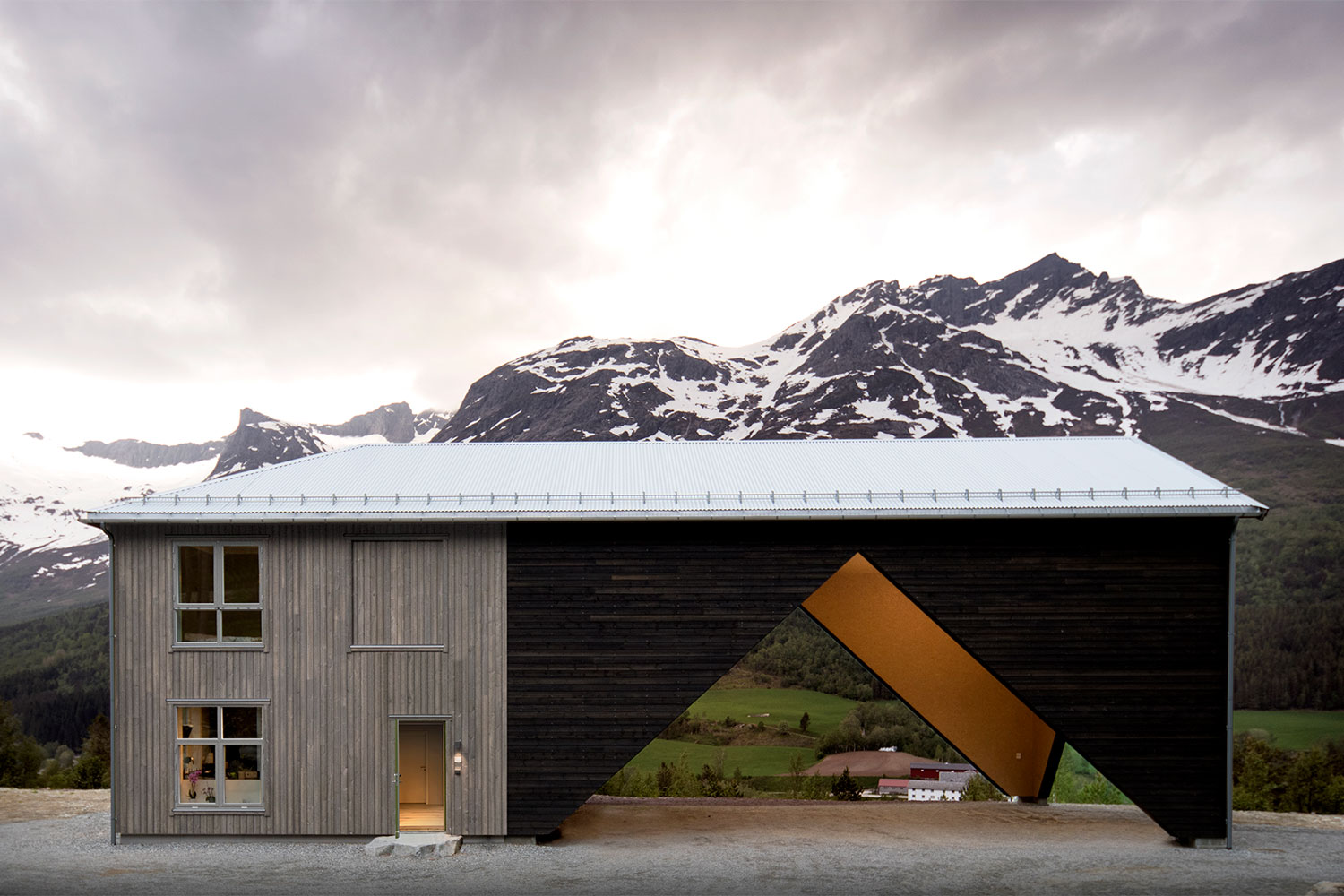
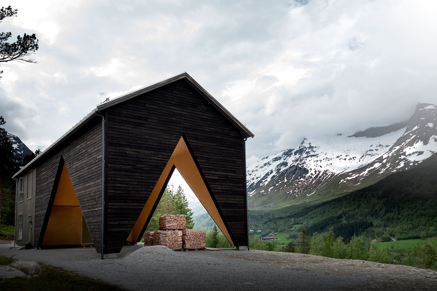
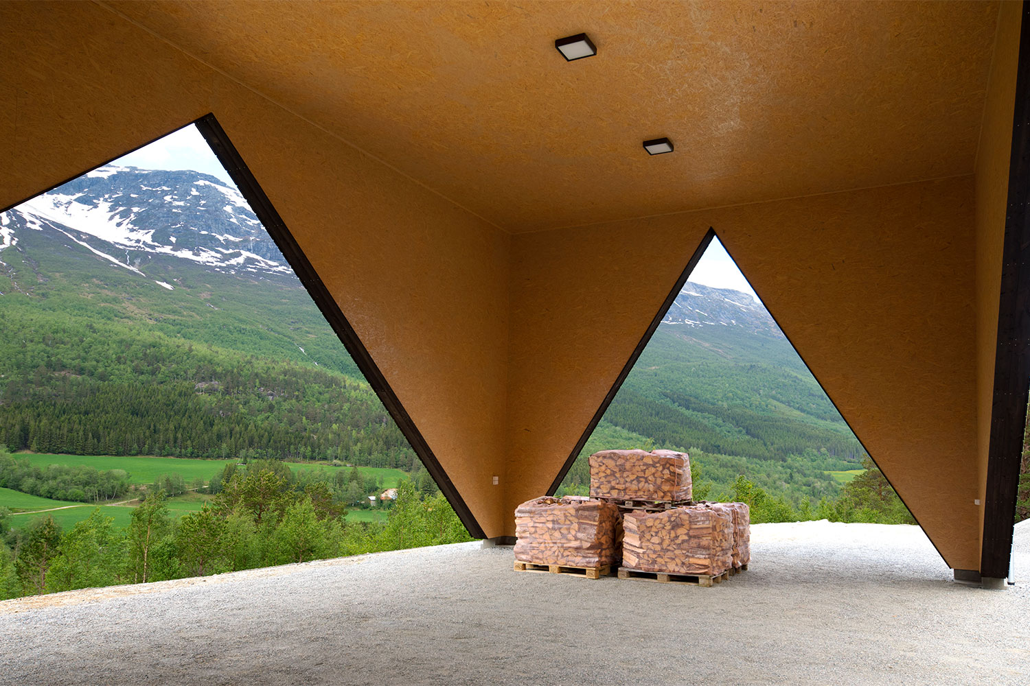
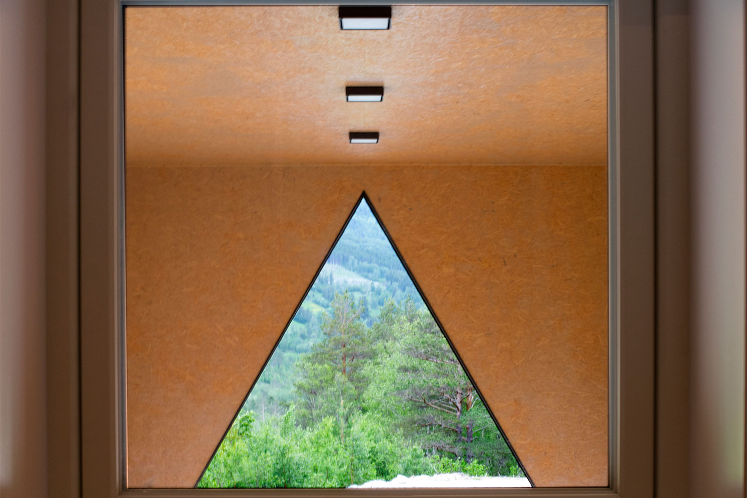
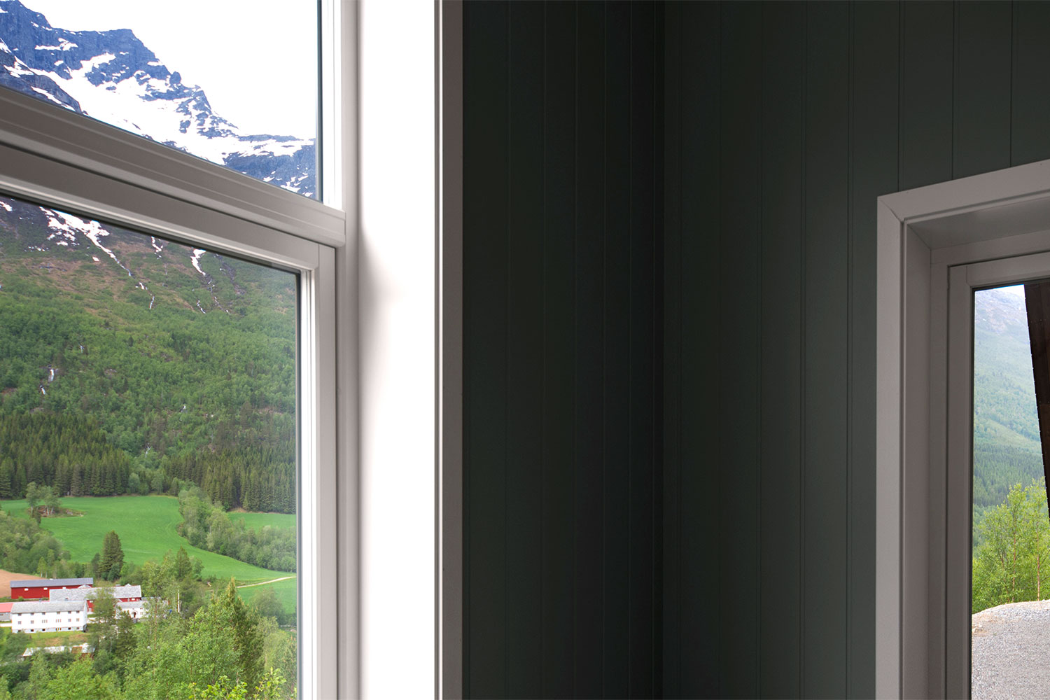
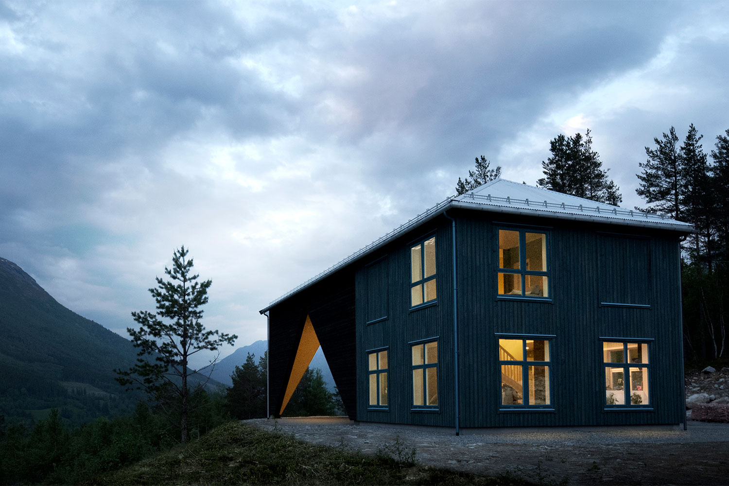
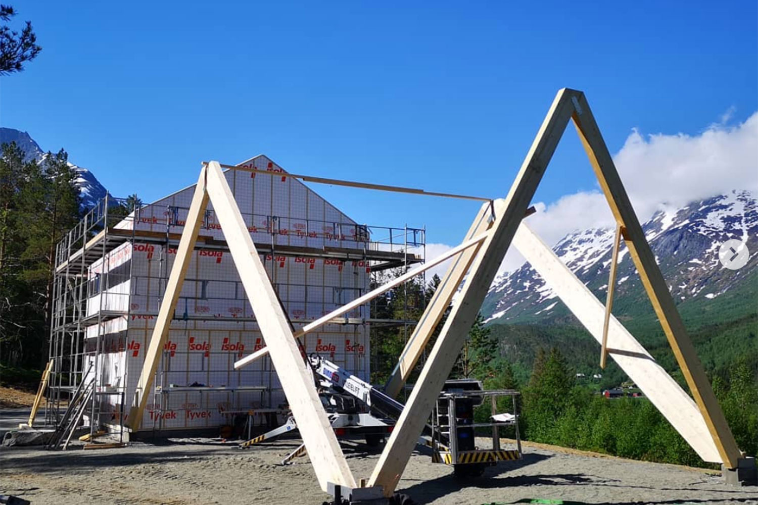
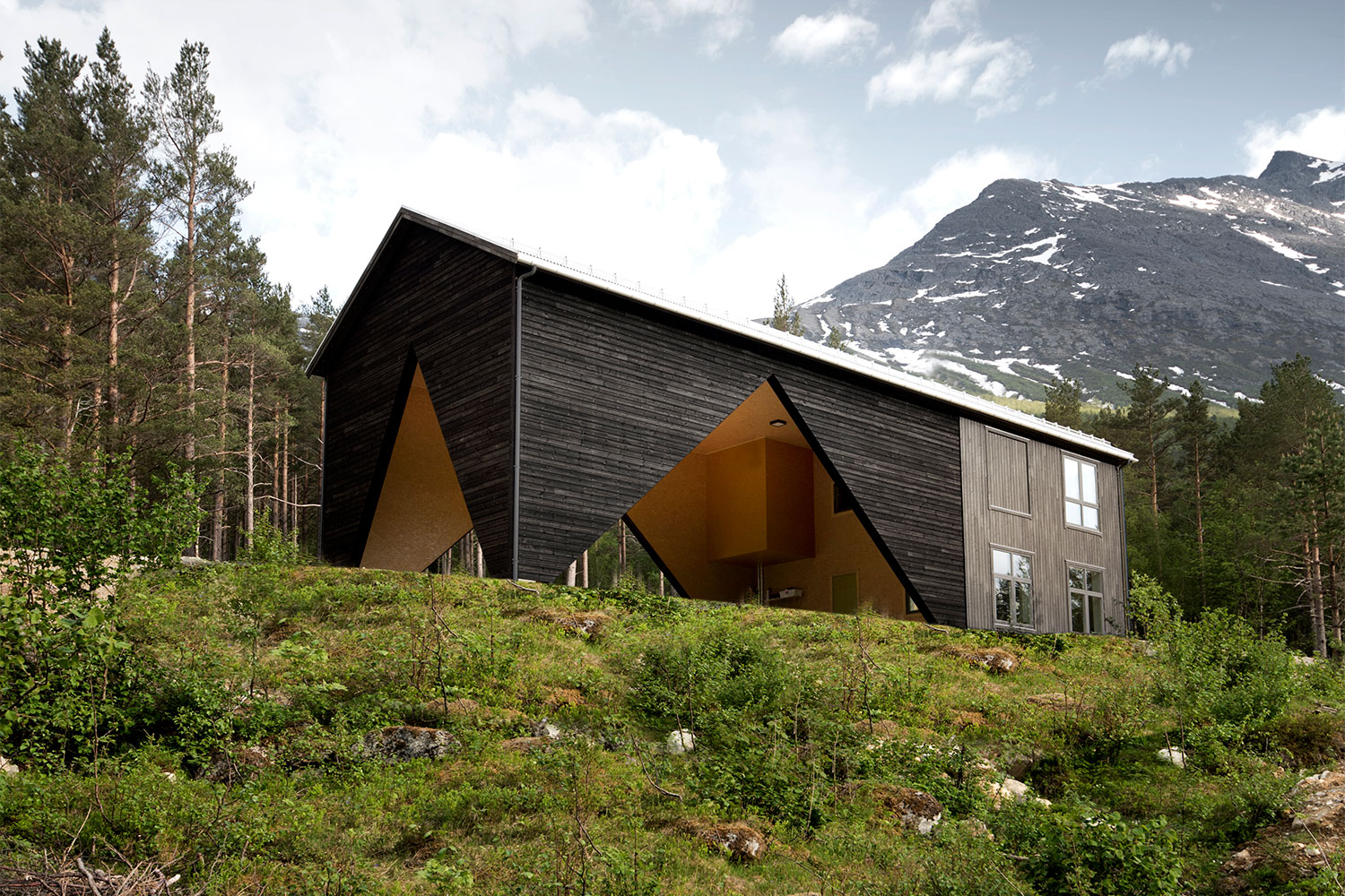
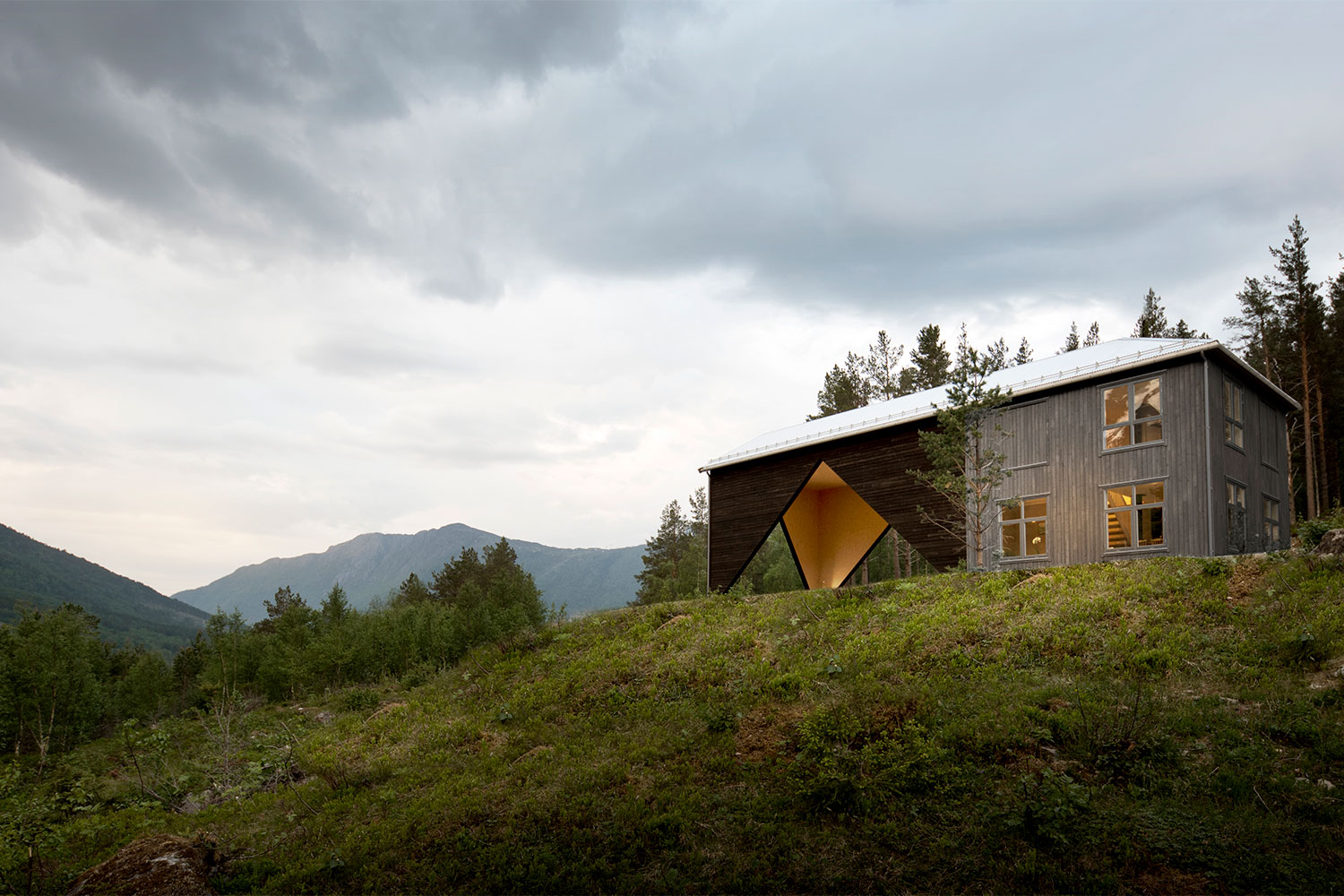
It wasn’t enough to create a simple structure attached to the two-story main house though. The vestibule space, which is connected to the home via the continuation of the roofline, is a piece of art in its own right. The tree-covered hills and snow-capped mountains that surround the property are carefully framed thanks to special glulam support columns that were installed at an angle. The result — the walls of the vestibule form large triangles that cleverly capture views of the lush landscape.

Recognizing the clients’ desires to keep the home simple, the architects created the main house as a basic square box. Coming up the driveway, you can only see the “finished” part of 1/3 Hus with the vestibule hidden behind it. This creates a quaint, cozy visual to welcome guests. Inside, the simplicity continues. Each floor is 538 square feet and the plan is laid out around a central “warm core” — allowing warmth from utility spaces like the laundry room to seep into the surrounding areas. On the outside, this part of the home is clad in light gray wood that was laid vertically and fitted with traditional rectangular windows.

In contrast, the uninsulated vestibule is wrapped in darker wood planks laid horizontally. The dark exterior looks even more dramatic when you get peeks of the interior of the open-air vestibule. Finished in raw plywood, the natural brown creates a warm contrast to the dark exterior. When the couple decides to expand the liveable space of the home, the angled glulam columns will remain in place and that triangular shape will still be visible – a reminder of the home’s unique beginning.

For now, 1/3 Hus is exactly what the clients wanted. A cozy space for the husband and a wide open work area for the wife, who is a deer hunter. As the years go by and they grow their family, the home will grow with them. A unique home for a unique couple will slowly morph into a traditional home for a traditional family.
Kelsey Machado
Former Digital Trends Contributor
Kelsey is a professional interior designer with over a decade of experience in the design field. With a passion for…
A Renovation Turned This Dreary Space Into a Stylish Urban Abode
olivier nelson residence nature humaine architecture design 7

If you’ve ever strolled the streets of Montreal, you know it’s a city of contradictions. While the downtown business district is packed with modern skyscrapers lining the St. Lawrence River, stepping into the surrounding historic neighborhoods is like traveling back in time to 1800s France. Narrow streets are lined with little shops, quaint cafes, and traditional European-style row houses. In this old-meets-new city, one rundown duplex received a thoroughly contemporary makeover that makes it stand out from its neighbors yet perfectly match the vibe of Montreal.

Renovated in 2019 by the team at Nature Humaine Architecture and Design, the Olivier Nelson Residence was originally a duplex row house. Sandwiched between two other homes, the interior was dark, almost cave-like, the layout wasn’t functional, and the design was dated. The team at Nature Humaine turned the structure into a brightly lit single-family home.

Read more
A Futuristic Minimalist Home Hugs the Hills in Southern California
bridge house belzberg architects minimalist architecture 6

Minimalist homes never go out of fashion. The clean lines are visually appealing and the monochromatic color palette offers a blank slate to build upon should the desire for change arise. But minimalism also hasn’t changed much over the years, resulting in homes that tiptoe close to becoming cookie-cutter.

Thankfully, the folks at Belzberg Architects have created a sophisticated home that checks all of the minimalist boxes while putting a futuristic spin on things. Bridge House says “no thanks” to the traditional black and white color palette typical of minimalist homes, embracing soothing tones for a sophisticated finish.

Read more
This Home Matches the Black Sands of Piha Beach with an Equally Dark Exterior
Kawakawa House

Beach houses all have one thing in common -- bright, airy spaces with coastal cool style designed to let in those salty ocean breezes. But what happens when the site is shrouded in trees, backed by a steep mountain slope that blocks direct sunlight, and happens to have a giant house in front of it, blocking those coveted water views? The team at Herbst Architects faced this challenge head on, creating Kawakawa House -- an award-winning year-round beach house that is anything but common. 

Kawakawa House is located on Piha Beach in New Zealand. Known for its black sands and great surf conditions, it’s a desirable place for ocean lovers and many large vacation homes already exist there. With the mountains rising sharply not too far from the water’s edge, there are limited spots for new builds. Along with the existing home that obscured the water views, and the mountain to the north that blocked much of the direct sunlight, the site was also full of old-growth Pohutukawa -- also known as New Zealand Christmas trees -- blocking even more natural light from reaching the interior. Rather than hinder the design, these challenges helped shape Kawakawa House into a stunning space, filled with natural light and enviable water views.

Read more