Portland, Oregon, has no shortage of trendy, cutting-edge style. All of the latest designs in everything from fashion to homes can be found in the Rose City. But a new hotel in the heart of downtown is showing that the best designs are the ones that blend old and new into a fresh and sophisticated look.
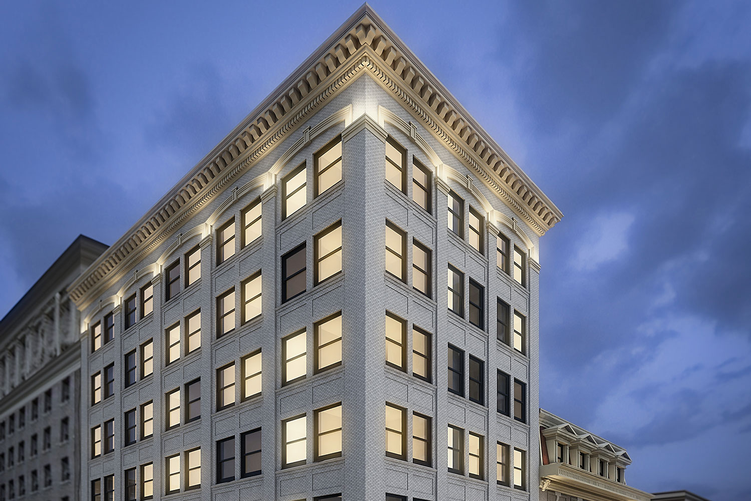
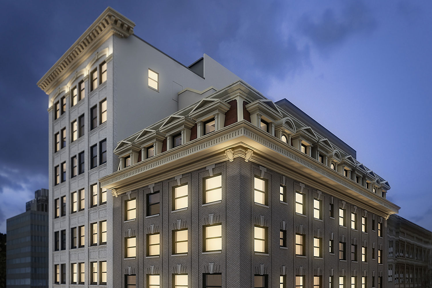
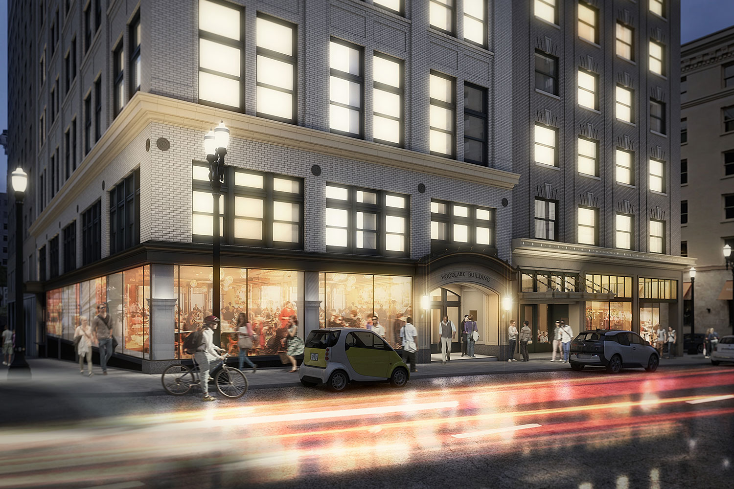
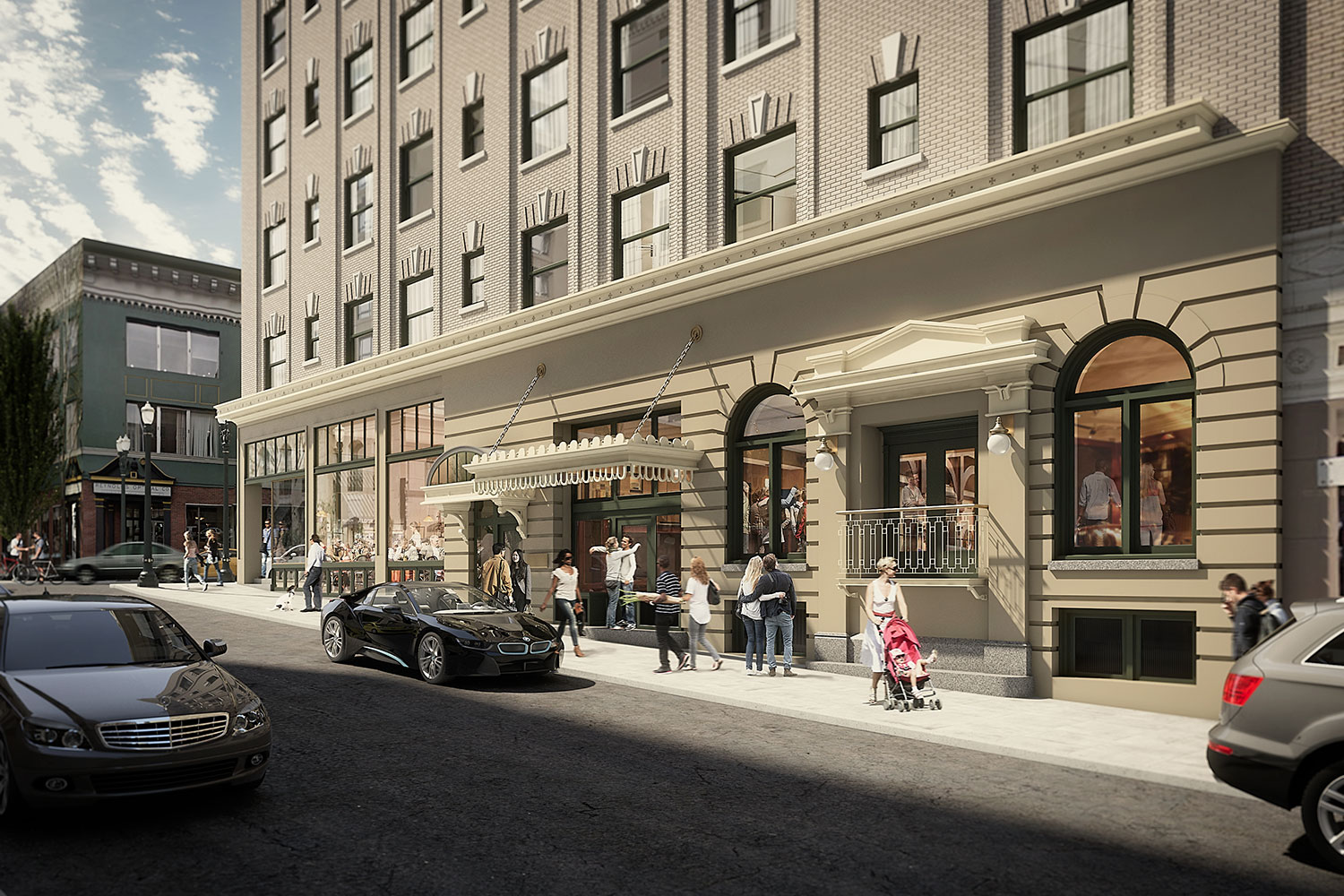
The Woodlark is a relaxing retreat created from two historic Portland buildings, stitched together by the design sense of R&A Architecture and Design. The Cornelius Hotel, originally built in 1908, thrived in the 1920s and became known as “The House of Welcome.” Even though it was placed on the National Registration of Historic Places, the building stood vacant for years before the remodel to turn it into the Woodlark began. The French Renaissance-style Cornelius building was combined with the Beaux Arts-style Woodlark Building next door to create the all-new Woodlark.
While ultra-trendy, forward-thinking hotels have been opening in the area, the Woodlark looked to its historic past for design inspiration. The exteriors of the two buildings were restored to their original brilliance and a new art deco neon sign was added to remind visitors that this is still the “House of Welcome.”

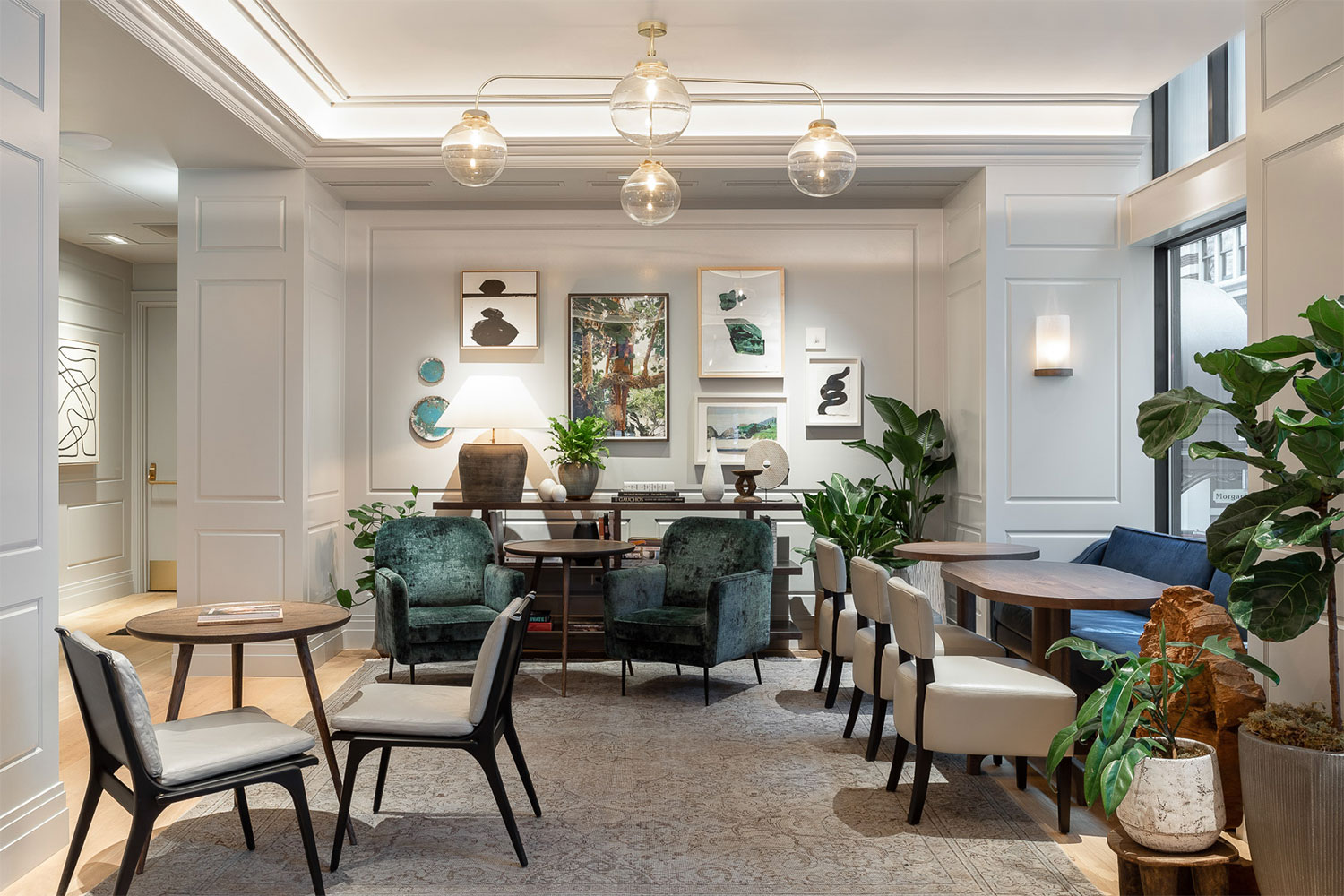
Inside, the lobby and public spaces speak to the high-end style and sophistication of the buildings’ glory days of the 1920s. While hexagonal penny tile was all the rage then, the floor of the lobby added a trendy twist by incorporating oversized hexagon tile. The dark wood wrap-around reception desk topped with Carrara marble makes a bold statement, letting guests know they are in for an exciting design experience.
While there are countless classic and traditional elements throughout the lobby, like wood paneling and soft fabrics, Woodlark also recognizes the ever-evolving style of the city by incorporating unique touches like cork planters, black steel-framed doors, and mid-century revival seating. It’s an eclectic blending of timeless styles all in one impressive lobby.
Want to fully immerse yourself in the historic look of the past? The best spot is in Abigail Hall where a winding banquette allows you to relax near the fire with one of the bar’s classic cocktails. Seating, lighting, and even the wallpaper speak to the French Renaissance style of the original Woodlark building.

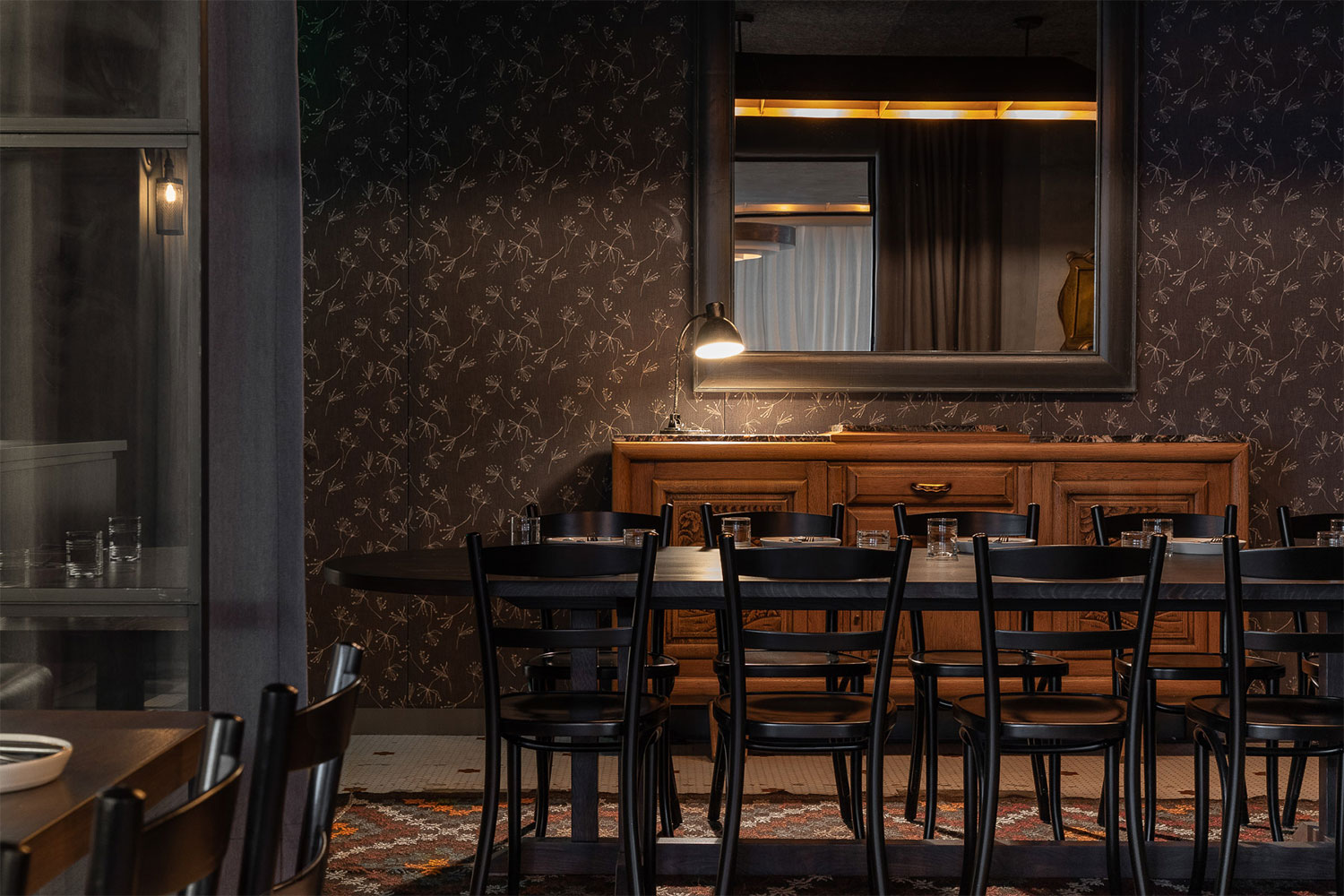
For a decidedly more masculine spot to unwind, check out the Bullard Dining Room. Dark gray concrete walls accented with deep brown wallpaper, leather seating, and antlers on the walls create a smoking-lounge vibe in the dimly lit space. And while all of the public spaces are heavily influenced by styles of the past, it all still feels fresh and new, a theme that continues in the suites.
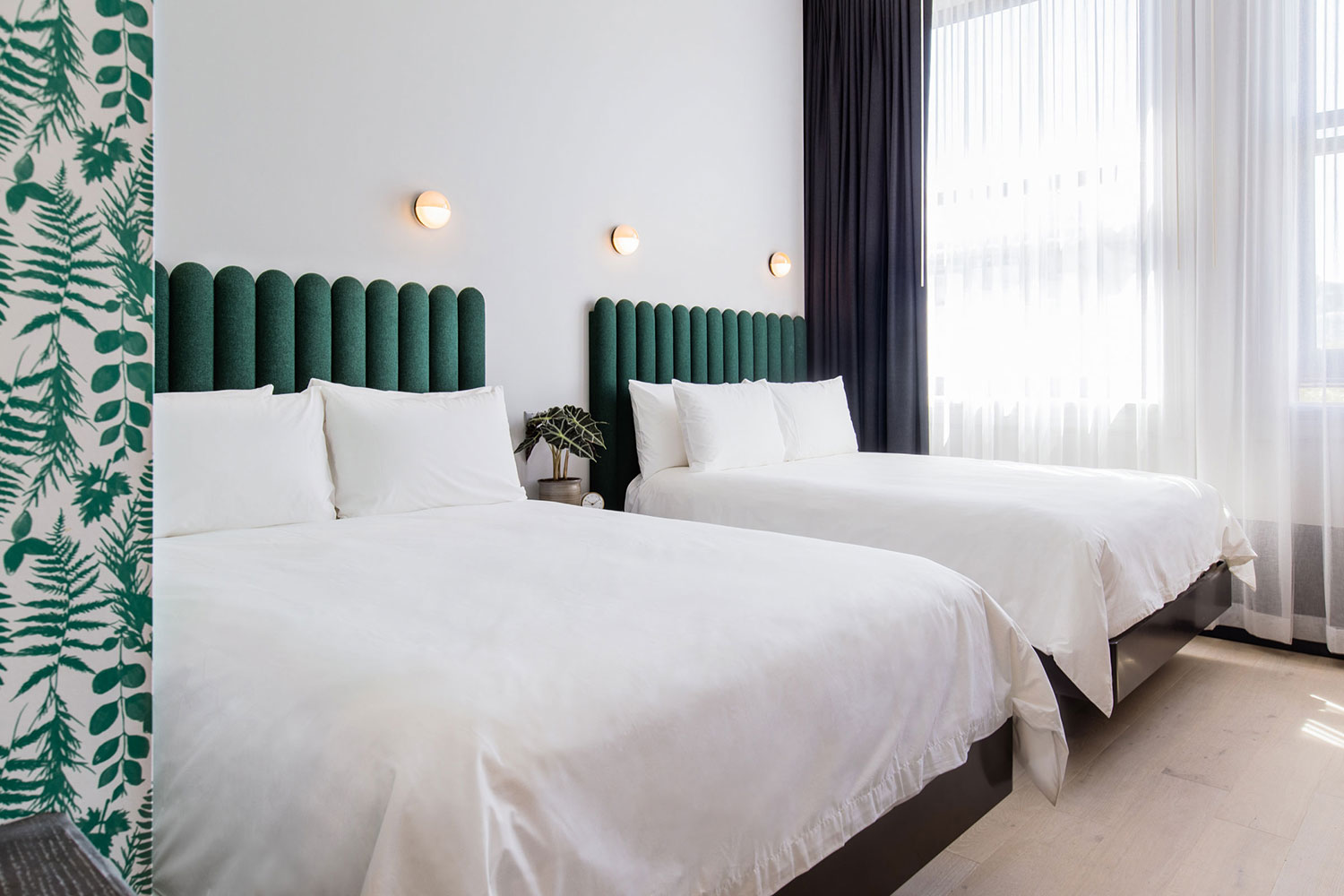
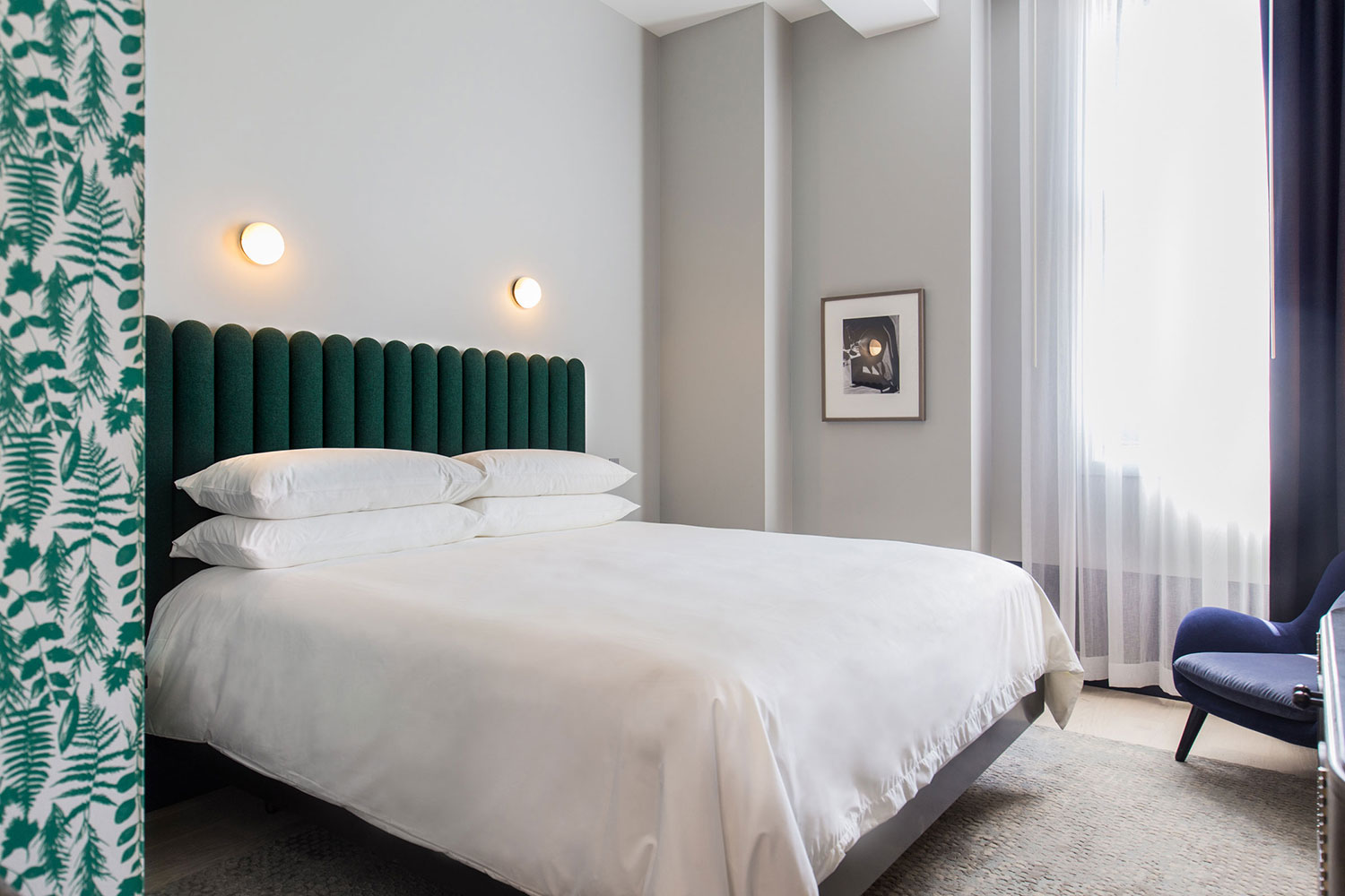
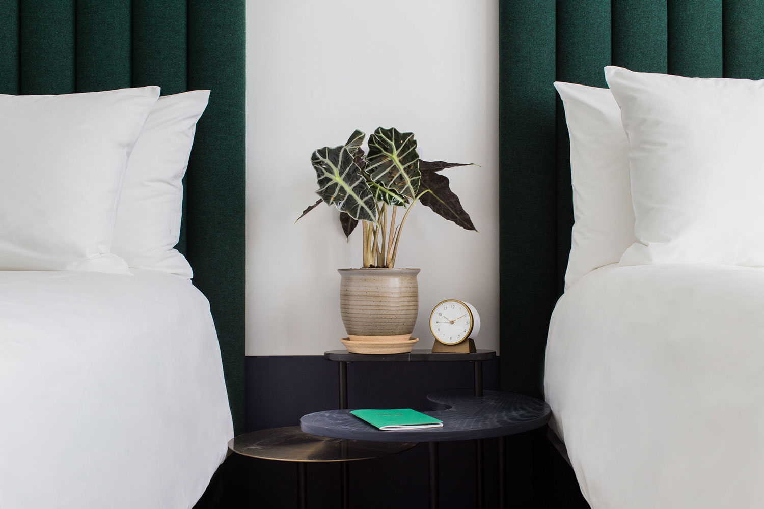
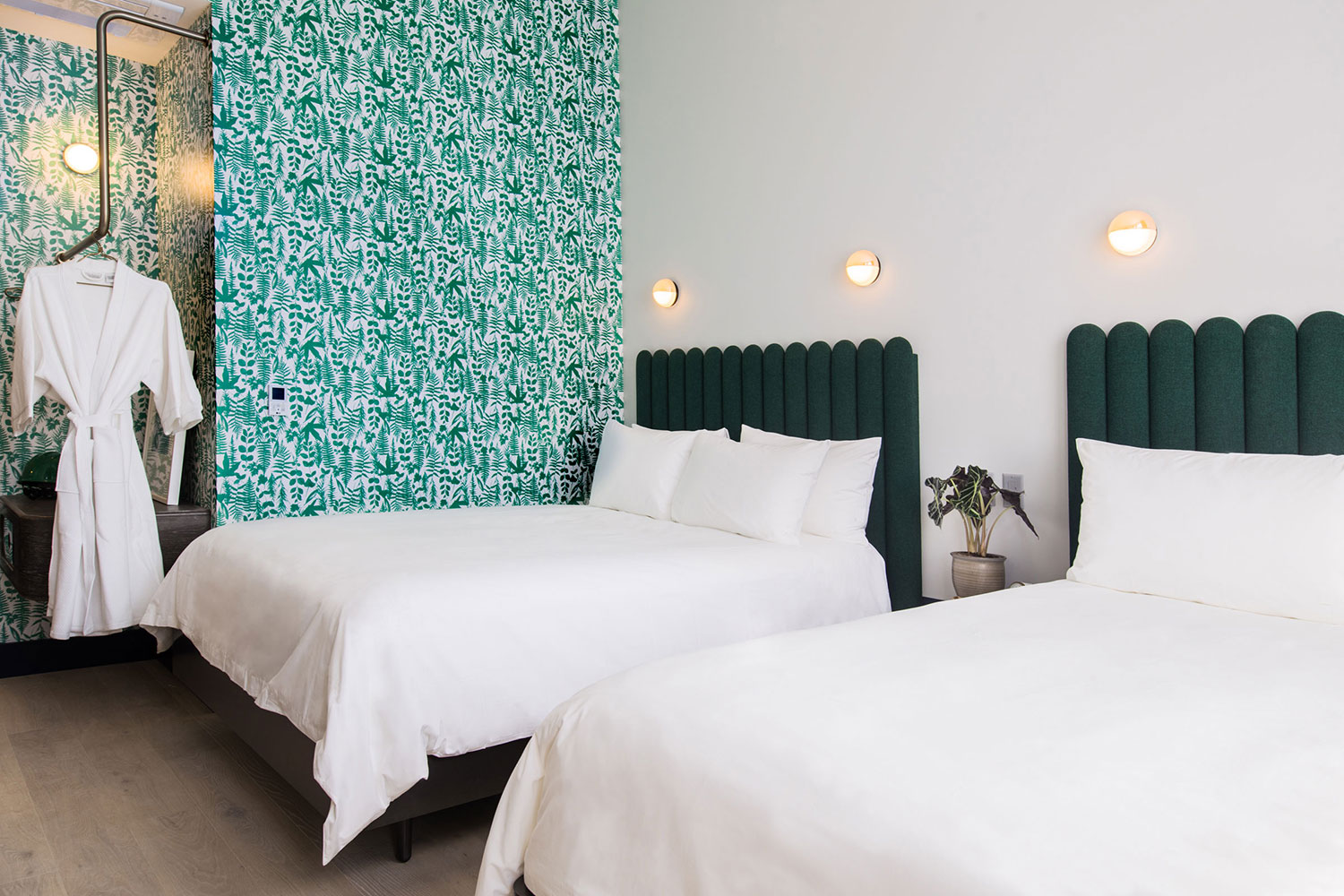
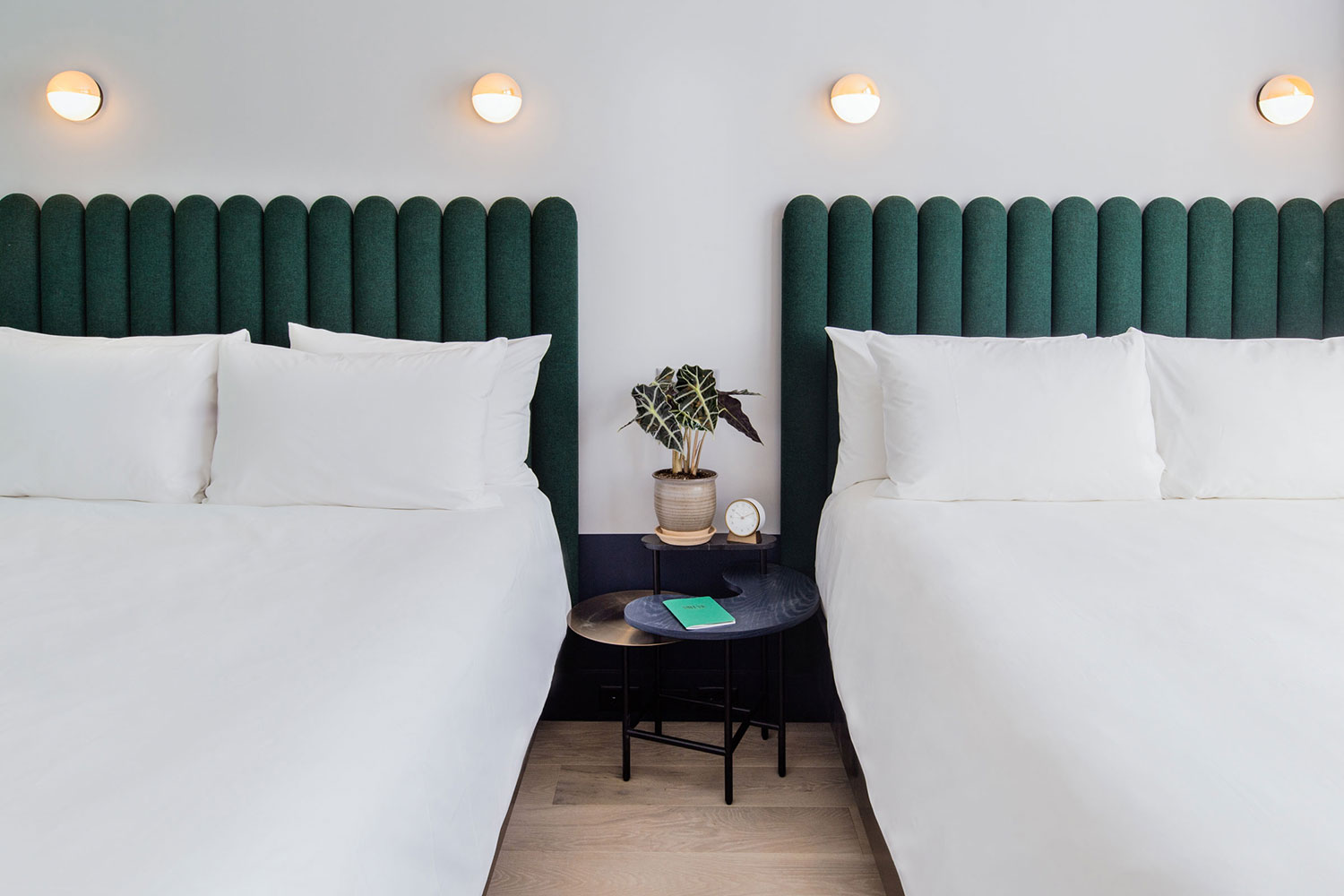
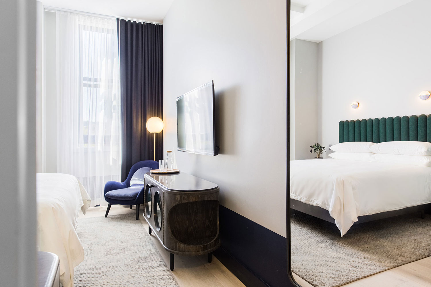
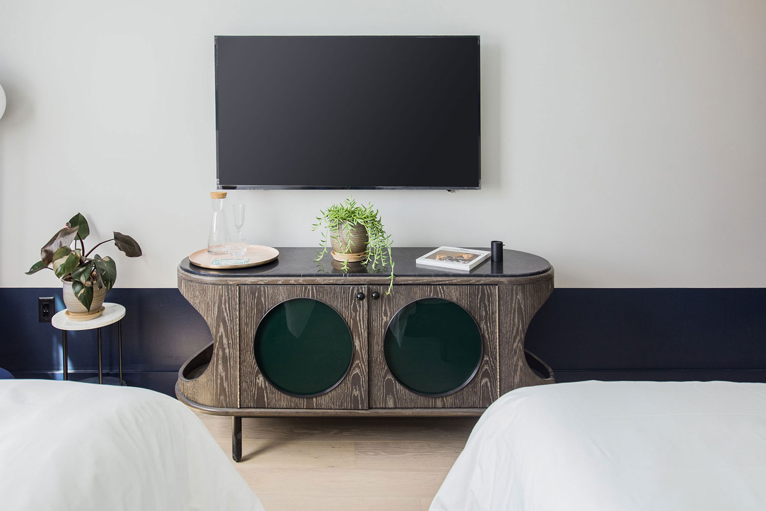
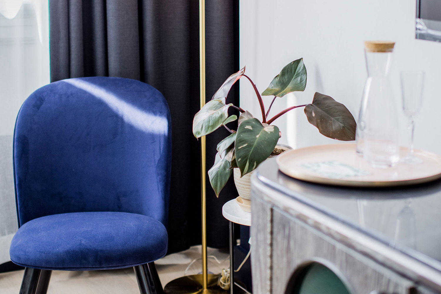
All of the rooms at Woodlark were kept simple yet high-style. Crisp white linens on the beds contrast with the deep green upholstered headboards. Flooring is light wood topped with pale gray area rugs. The walls of the rooms are painted off-white with wallpapered accent walls. The pattern on the wallpaper varies between rooms, but all are green and coordinate with the headboards. Art deco accents are sprinkled throughout, like the lighting and the stylish bars.
Inside and out, Woodlark is a beacon of design for downtown Portland.
By blending the classic sophisticated styles of the past with the cutting-edge looks of today, the hotel is a welcoming and immersive design experience for locals and visitors alike.
Are you prepping for your own Portland vacation? If so, listen to our editors talk their love of Portland with Jeff Miller, president and CEO of Travel Portland.
